|
|
|
This thread is locked; no one can reply to it.

|
1
2
|
| cabinet drawings take 2 |
|
Neil Walker
Member #210
April 2000
 |
Following comments on my cabinet my mate felt sorry for me and designed this. Much better I think. Not finished yet, but it's getting there: {"name":"606969","src":"\/\/djungxnpq2nug.cloudfront.net\/image\/cache\/f\/3\/f38a1e8664a27551d5822aefba609610.jpg","w":394,"h":871,"tn":"\/\/djungxnpq2nug.cloudfront.net\/image\/cache\/f\/3\/f38a1e8664a27551d5822aefba609610"} Neil. wii:0356-1384-6687-2022, kart:3308-4806-6002. XBOX:chucklepie |
|
Dennis
Member #1,090
July 2003
 |
The shadow behind the creature does not make sense as it contradicts the direction of light suggested by the red highlights on the fur. Looks retrolicious though. --- 0xDB | @dennisbusch_de --- |
|
Elias
Member #358
May 2000
|
There could be two light sources. -- |
|
Dennis
Member #1,090
July 2003
|
True but given that shadow, the front side would be almost fully lit instead of being pitch black like a back-lit silhouette. --- 0xDB | @dennisbusch_de --- |
|
weapon_S
Member #7,859
October 2006
 |
TBH I liked the previous better (IIRC |
|
Kris Asick
Member #1,424
July 2001
|
*gives an evil look at Dennis and Weapon_S* I think this new design is awesome! I like the font choice, the placement, and the fact that the beast in the middle has this sort of effect to make it look like it's leaping off of the machine itself. For those confused about the shadow/lighting, sure, the highlights may SEEM like they're coming from the wrong direction, but you're trying to draw highlights on something BLACK in order to make it feel like more than just a flat drawing. Visually, the way it is now works better than trying to make the lighting accurate to the shadow or vice versa. If you don't agree then I challenge you to go load up a paint program, copy a screenshot of the monster into it, "fix" it the way you feel would be right, compare to what Neil's got, then see for yourself. --- Kris Asick (Gemini) |
|
Neil Walker
Member #210
April 2000
|
There were a few more examples to choose from, he's also vectorised some metal slug (my favourite game) but I haven't seen them yet: {"name":"606970","src":"\/\/djungxnpq2nug.cloudfront.net\/image\/cache\/e\/c\/ecd095d654d21f624f38ecc7830fbdbf.jpg","w":957,"h":609,"tn":"\/\/djungxnpq2nug.cloudfront.net\/image\/cache\/e\/c\/ecd095d654d21f624f38ecc7830fbdbf"} Neil. wii:0356-1384-6687-2022, kart:3308-4806-6002. XBOX:chucklepie |
|
Kris Asick
Member #1,424
July 2001
|
*looks over those ones* ...still like the one at the top of the thread best. --- Kris Asick (Gemini) |
|
Neil Walker
Member #210
April 2000
|
Well, I had already sprayed the sides yellow so even if I had a choice I could only mask it for painting using 1 or 2. I'll post a pic when my mate sends me them as we used his camera. Unfortunately the masking tape didn't take in some places so needs touching up in places. The font will probably be white as the yellow vinyl I have doesn't match the yellow paint. Neil. wii:0356-1384-6687-2022, kart:3308-4806-6002. XBOX:chucklepie |
|
Dennis
Member #1,090
July 2003
|
The real problem here isn't the shading anyway. The root cause of making it look awkward is that the given silhouette does not suggest any believable volume. Even changing the lighting does not manage to fix that and it stays mostly flat. Lack of a distinguishable type of foot or hoof on the front leg is another issue. If you look at the legs, they both seem to be bent convex towards the viewer, creating a stance which if imagined from the side looks silly but not threatening or menacing (which is what it's probably supposed to look like). Here's a sloppy edit, illustrating the volume problems by an attempt at lighting without changing the silhouette: --- 0xDB | @dennisbusch_de --- |
|
Neil Walker
Member #210
April 2000
|
Interesting.and quite scary. You do know that image is as it is on the original space invaders cabinet? Neil. wii:0356-1384-6687-2022, kart:3308-4806-6002. XBOX:chucklepie |
|
Kris Asick
Member #1,424
July 2001
|
*quickly looks up pictures of Space Invaders machines* ...that makes it even more awesome than it already was! --- Kris Asick (Gemini) |
|
Neil Walker
Member #210
April 2000
|
Here's another one (Metal Slug inspired) {"name":"606985","src":"\/\/djungxnpq2nug.cloudfront.net\/image\/cache\/0\/b\/0b35b9e03708cffedf2bac053ab1208d.jpg","w":265,"h":646,"tn":"\/\/djungxnpq2nug.cloudfront.net\/image\/cache\/0\/b\/0b35b9e03708cffedf2bac053ab1208d"} Neil. wii:0356-1384-6687-2022, kart:3308-4806-6002. XBOX:chucklepie |
|
Kris Asick
Member #1,424
July 2001
|
Not bad, though I still prefer the Space Invaders one. --- Kris Asick (Gemini) |
|
Elias
Member #358
May 2000
|
I kinda like Dennis' version. -- |
|
Neil Walker
Member #210
April 2000
|
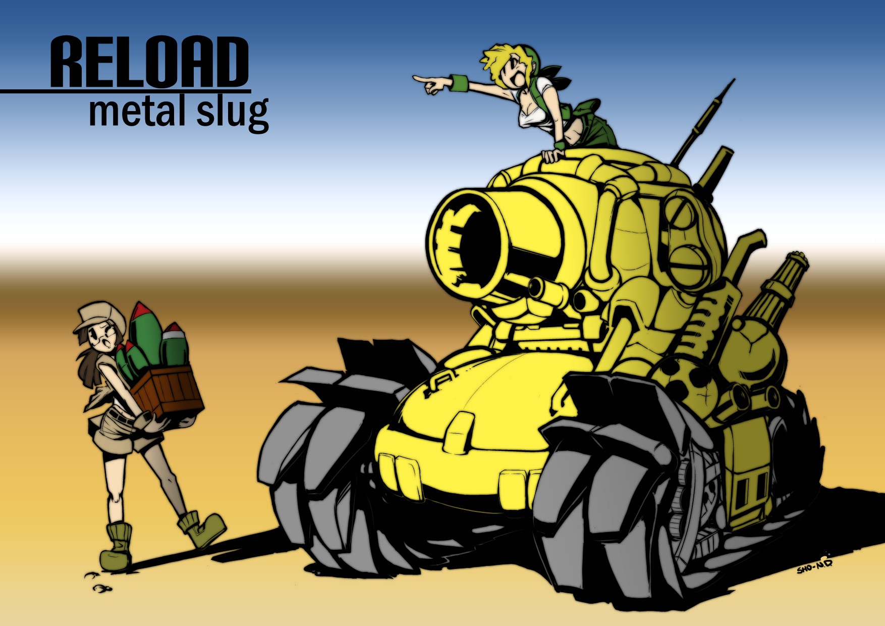
Hello, A bit more work has been done on the images: If anyone is interested, the source for the tank is here: My mate converted it to vectors. Here is a mock-up with the art and the real photo: Neil. wii:0356-1384-6687-2022, kart:3308-4806-6002. XBOX:chucklepie |
|
_Kronk_
Member #12,347
November 2010
|
I <3 the tank. This is the first design from this thread that I really really like -------------------------------------------------- My blog: http://joshuadover.tumblr.com |
|
pkrcel
Member #14,001
February 2012
|
Seconded, the Tank really stands out. It is unlikely that Google shares your distaste for capitalism. - Derezo |
|
Dennis
Member #1,090
July 2003
|
Neil Walker said: You do know that image is as it is on the original space invaders cabinet? I did not know. That fact does not make it any better though because the errors are still there. That Metal Slug art on the other hand looks great and does a really good job at suggesting believable volume. --- 0xDB | @dennisbusch_de --- |
|
Ben Delacob
Member #6,141
August 2005
 |
I would try (maybe better, maybe not) adding a little bit of shading (similar to the barrel) just next to the girl/woman to help balance the level of detail between her and the tank. Even if you don't, it's pretty sweet. __________________________________ |
|
weapon_S
Member #7,859
October 2006
|
Those look a lot better IMHO. |
|
Specter Phoenix
Member #1,425
July 2001
 |
I love the tank panel. The treads even make it look like it could roll right off the panel and go up any surface. Definitely awesome.
|
|
Steve Terry
Member #1,989
March 2002
 |
... and it's got boobies ___________________________________ |
|
Arthur Kalliokoski
Second in Command
February 2005
 |
You could cut'n'paste some boobies on the monster, ya know! They all watch too much MSNBC... they get ideas. |
|
Specter Phoenix
Member #1,425
July 2001
|
Nah, the tank would have been kick ass even if it had a guy on it.
|
|
|
1
2
|


 ) I think you will get problems with balancing out the opposite panel esthetically.


