|
|
|
| Anyone want a website? |
|
Edgar Reynaldo
Major Reynaldo
May 2007
 |
I think the Tom's computer website looks pretty good, but I don't think it uses screen space very well. I think a table would look better - a table that included the pricing on the right hand side of the service description. And there would also be room to put the mini map on the right hand side of the table :
                 |  Services                     | Pricing   |    ---------------
-------------------------------------------------------------|    |             |
Repair/Upgrades  | Blah....                      | from $40* |    |             |
                 |                               |           |    |   MAP       |
-------------------------------------------------------------|    |             |
Threat removal   | Blah....                      | from $X   |    |             |
-------------------------------------------------------------|    ---------------

*Plus materials where applicable
Once that was done, you could remove the 'Services / Pricing / Location' header bar because it would be unnecessary. My Website! | EAGLE GUI Library Demos | My Deviant Art Gallery | Spiraloid Preview | A4 FontMaker | Skyline! (Missile Defense) Eagle and Allegro 5 binaries | Older Allegro 4 and 5 binaries | Allegro 5 compile guide |
|
Thomas Fjellstrom
Member #476
June 2000
 |
It's been suggested that people WON'T read a page that's too wide. Especially if there's too much text. -- |
|
Trent Gamblin
Member #261
April 2000
 |
If it was me I would condense the whole service list into a small paragraph or bullet list with links (possibly just floating tooltip type things with the extra information you have there now). I would also do what Matthew said and just give a starting price and leave it at that (with a note that parts cost extra)
|
|
Edgar Reynaldo
Major Reynaldo
May 2007
|
Thomas Fjellstrom said: It's been suggested that people WON'T read a page that's too wide. Especially if there's too much text. With a table, you wouldn't have to worry about that, because people can just glance at the headers to see if they are interested and then if they are they can read the text that goes with it. If they are truly interested in receiving computer service, they will take the time to read what is there if it is not too long, and I think the amount of description is perfect as it is. Up to you. My Website! | EAGLE GUI Library Demos | My Deviant Art Gallery | Spiraloid Preview | A4 FontMaker | Skyline! (Missile Defense) Eagle and Allegro 5 binaries | Older Allegro 4 and 5 binaries | Allegro 5 compile guide |
|
bamccaig
Member #7,536
July 2006
 |
Matthew Leverton said: Jesse is right,...
I think you're putting words into Jesse's mouth. Matthew Leverton said: Even if it's accurate, most people don't read anything. The average person just wants to know whether or not you can fix computers... *snip* Nobody is going to think "my computer case needs to be cleaned." Each of those four things could be a large "icon" image in a 2x2 pattern, or something like that. As little text as possible. If somebody happens to click on one of those things, then it could take them to a page explaining some of the services in more detail (not that anybody really cares).
I agree with this though. The target audience is completely clueless about computers. They just want it to be fixed. They don't know and don't want to know anything about what is wrong or what they could be doing better. Matthew Leverton said: But note how the services are very simply laid out without overwhelming amounts of text to read.
I don't note that at all. In fact, I find that home page rather difficult read or navigate. Edgar Reynaldo said: I think the Tom's computer website looks pretty good, but I don't think it uses screen space very well. I think a table would look better - a table that included the pricing on the right hand side of the service description. And there would also be room to put the mini map on the right hand side of the table
Tables suck, and not everybody has a wide monitor. This is probably especially true for the target audience of the Web site. -- acc.js | al4anim - Allegro 4 Animation library | Allegro 5 VS/NuGet Guide | Allegro.cc Mockup | Allegro.cc <code> Tag | Allegro 4 Timer Example (w/ Semaphores) | Allegro 5 "Winpkg" (MSVC readme) | Bambot | Blog | C++ STL Container Flowchart | Castopulence Software | Check Return Values | Derail? | Is This A Discussion? Flow Chart | Filesystem Hierarchy Standard | Clean Code Talks - Global State and Singletons | How To Use Header Files | GNU/Linux (Debian, Fedora, Gentoo) | rot (rot13, rot47, rotN) | Streaming |
|
Anomie
Member #9,403
January 2008
 |
Thanks for the thoughts, there's a lot I want to say! I think it's really important to make sure that the website brings in business the way that Thomas wants. If he wants customers to come to him with a full understanding of what they're getting into, the website needs to be pretty content-heavy -- the task is presenting lots of specifics in a small space without attacking the visitor. If he wants the website to act as a 'hook' to drive people to contact him for specifics, the task is to make something that draws people in and speaks in a general and attractive way (with little copy, big shapes and so on). Being that this started as a 'makeover' I didn't really change the layout at all, I just made cosmetic changes. If we're talking a full rebuild, I think more input from Thomas would be good before I start taking liberties with how he does business and what information he conveys to customers. Or if he doesn't feel like dealing with all this I could just send over the HTML and CSS and call it good. ______________ |
|
Thomas Fjellstrom
Member #476
June 2000
|
Anomie said: Being that this started as a 'makeover' I didn't really change the layout at all, I just made cosmetic changes. If we're talking a full rebuild, I think more input from Thomas would be good before I start taking liberties with how he does business and what information he conveys to customers. To be honest, I'd like to do both, if possible. Simple "hook" landing page with enough info to get people to call, but also somehow provide more information. Either via fancy tool tips, collapsible "info boxes" or even separate pages. -- |
|
Anomie
Member #9,403
January 2008
|
Thomas Fjellstrom said: To be honest, I'd like to do both, if possible. [...] Either via fancy tool tips, collapsible "info boxes" or even separate pages.
The first two options there are easy but can hurt accessibility and make it harder to convert into a mobile design. The third option keeps everything accessible and mobile-friendly, but coming up with new content for the pages is a lot of work. So that'd be another choice for you to make. I'd suggest separate pages. Another option with that is to do some progressive enhancement afterward and AJAX the full page content into the landing page on request. The layout could shift to accommodate and you'd still have that simple pamphlet-like interaction with the page. Matthew Leverton said: Even if it's accurate, most people don't read anything.
bamccaig said: The target audience is completely clueless about computers. They just want it to be fixed. I definitely took some time to reduce the copy and remove as much technical language as I could from it. For a redesign, I might suggest you go so far as to categorize your services into customer problem statements - that introduces its own challenges, but would be the easiest for a customer to digest. Edgar Reynaldo said: I don't think it uses screen space very well. I think a table would look better The page right now is fixed at 700px wide, which is about 250px narrower than I usually make stuff. But like bam said, you can't count on super-wide monitors, and I feel like ~950px is a good compromise between something like this and a full-width layout. I also think tables suck, but some horizontal action is important - something slightly more tabular than a plain list is good. I'm picturing widening the site out to 950px or so and doing a more magazine-like layout. Thomas Fjellstrom said: It's been suggested that people WON'T read a page that's too wide. Especially if there's too much text.
That's really important too, I think the only full-width pages I put up with on a regular basis are Gmail and the PHP.net manual pages. ______________ |
|
Arthur Kalliokoski
Second in Command
February 2005
 |
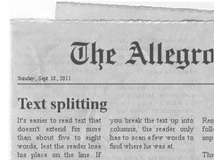
Thomas Fjellstrom said: It's been suggested that people WON'T read a page that's too wide. Especially if there's too much text. It's too easy to lose your place on the line, that's why magazines split text into two or more columns on a single page. {"name":"fb776192078f4b4087ac7371394fc345.0.jpg","src":"\/\/djungxnpq2nug.cloudfront.net\/image\/cache\/7\/3\/73be0845533781a557095a2ca31c4a10.jpg","w":370,"h":279,"tn":"\/\/djungxnpq2nug.cloudfront.net\/image\/cache\/7\/3\/73be0845533781a557095a2ca31c4a10"} They all watch too much MSNBC... they get ideas. |
|
Thomas Fjellstrom
Member #476
June 2000
|
Anomie said: I might suggest you go so far as to categorize your services into customer problem statements If I understand what you mean, that was my initial intent with my site, but I just couldn't figure out how to write it in a clear way, so we get what I have now. woo. Quote: So that'd be another choice for you to make. As I said earlier, I'd like landing pages for certain "jobs", to point specific ads at so people who click them, don't have to go find the one they are looking for. -- |
|
|
|


 But first: