What a bout an allegro logo challenge? Nothing official - but creating logos is fun and I am bored 
So, attached is my try - and now let's see your versions...
http://www.allegro.cc/files/attachment/592414
http://sonus.game-server.cc/logo.jpg
Given the entries in the last logo contest, I'd say the first part of Micah's slogan is true at least. 
Shall your comment doubt the truth of the second part? Shame on you, unbeliever!
We better spend out time on making good games
Um no. Actually, we don't.
We would if it wasn't for our jobs taking away all our time and motivation to work on our games in our freetime.:P
http://www.allegro.cc/files/attachment/592416
Its a masterpiece...
http://www.allegro.cc/files/attachment/592417
Shall your comment doubt the truth of the second part? Shame on you, unbeliever!
I'll believe when I see it.
SC: Will your logo only suit a black background?
SC: Will your logo only suit a black background?
Ah hem, thats my logo, spellcaster simply copied my idea changing the phrase ALLEGRO to black and the word OWNING to PROGRAMMING.
And yes, my logo will suite other background colors just fine 
Right now: Yes.
But it's no problem to create the same image on a white background. I found a neat little trick: If you have an image or text, transform it from rect to polar coordinates and then apply a motion blur/ wind effect, and then transform back from polar to rect coordinates you'll get this "visible light" effect.
Ah hem, thats my logo
Oh, sorry DD. Dunno how I missed that one
SC: What package are you using for this? All I have at the mo is MS Paint and i.Mage  .
.
Got my Adobe Creative Studio 3 (standard) a couple of days ago - that's why I was playing around with photoshop today.
meh.. needs more lens flairs.
Got my Adobe Creative Studio 3 (standard) a couple of days ago
You bastard! 
My wallet is still bleeding, heh. But Photoshop Elements got to limiting, I always wanted to have illustrator so I decided to use the upgrade phase to get Creative Studio for not quite the hefty sum it would normally cost me.
{"name":"616564943_6588f508a6.jpg","src":"\/\/djungxnpq2nug.cloudfront.net\/image\/cache\/d\/3\/d392ba30592ffc678f5b65051a134bda.jpg","w":500,"h":178,"tn":"\/\/djungxnpq2nug.cloudfront.net\/image\/cache\/d\/3\/d392ba30592ffc678f5b65051a134bda"}
Not that great, just wanted to go a different direction from the ultra-techno one that was already posted.
Also,
{"name":"617254698_5a81d28134.jpg","src":"\/\/djungxnpq2nug.cloudfront.net\/image\/cache\/3\/9\/39c71607bf8bb042ae18c8ef924a1fef.jpg","w":500,"h":178,"tn":"\/\/djungxnpq2nug.cloudfront.net\/image\/cache\/3\/9\/39c71607bf8bb042ae18c8ef924a1fef"}
Lens flare! 
Kibiz0r, thats cool. I have/had this idea for the wiki that keeps track of SVN commits, and Wiki edits/contributions and calculates a rating for the most "value", and I was thinking of calling people in it "Allegro Stars".
http://derezo.ebtech.net/pong-logo.jpg
http://derezo.ebtech.net/pong-logo2.jpg
http://derezo.ebtech.net/simple-logo.jpg
http://derezo.ebtech.net/powered-logo.jpg
http://derezo.ebtech.net/simple-logo2.jpg
http://derezo.ebtech.net/8ball-logo.jpg
Nothing very clever.
Spelly: got a higher res version I could stow away someplace for use in some game I will probably never make?
@spellcaster I like yours
could you make a animation .. where that light from behind turns in to the viewer revealing the black letters ?
would be cool
I like Derezo's second one, the white on black. Nice retro look.
I'm sorry... But somebody had to do it
{"name":"allegroti9.png","src":"\/\/djungxnpq2nug.cloudfront.net\/image\/cache\/3\/6\/364b72a46201c5783e3d9c74f22e2243.png","w":399,"h":201,"tn":"\/\/djungxnpq2nug.cloudfront.net\/image\/cache\/3\/6\/364b72a46201c5783e3d9c74f22e2243"}
Very Web 2.0
Why spend the time to make something from scratch when you can rip someone off?
One of the Google links was this:
http://www.starekompy.pl/475.html
I still have that machine. Great machine. That page said: Jest to kolejny nabytek z Allegro. Wonder what that means.
It translates to "There is next acquisition with (from) Allegro." according to http://www.poltran.com/
It means "one more thing i bought from allegro" (according to my girlfriend. Allegro.pl is a polish ~ebay btw)
spellcaster, Kibiz0r, and Derezo all have awesome candidates (minus the 8-ball one; that just doesn't seem right ). I can't really decide. spellcaster's looks slightly unpolished... Kibiz0rs looks very nice, but the star thing is kind of random...  The remaining Derezo candidates get my vote.
{"name":"d0dec831d040f4c090a5b3a1abe1aa4b.jpg","src":"\/\/djungxnpq2nug.cloudfront.net\/image\/cache\/9\/e\/9ebecbe544d2a30572fb4749246de5f0.jpg","w":452,"h":196,"tn":"\/\/djungxnpq2nug.cloudfront.net\/image\/cache\/9\/e\/9ebecbe544d2a30572fb4749246de5f0"}
{"name":"1802ec2f03c2f2ac063085c630f645f1.jpg","src":"\/\/djungxnpq2nug.cloudfront.net\/image\/cache\/1\/c\/1caaa3391e8ca3b9ad3104e1fb6f213c.jpg","w":265,"h":79,"tn":"\/\/djungxnpq2nug.cloudfront.net\/image\/cache\/1\/c\/1caaa3391e8ca3b9ad3104e1fb6f213c"}
{"name":"48d5dc4adcd219844b2a37e2dcd5d920.jpg","src":"\/\/djungxnpq2nug.cloudfront.net\/image\/cache\/6\/2\/623a835ed6153e6e3ee99e038c04c552.jpg","w":251,"h":146,"tn":"\/\/djungxnpq2nug.cloudfront.net\/image\/cache\/6\/2\/623a835ed6153e6e3ee99e038c04c552"}
{"name":"7eba6f4260ed1fe54581348a1fc10e49.jpg","src":"\/\/djungxnpq2nug.cloudfront.net\/image\/cache\/1\/0\/1099b7a3a45a45ce953d35b4e269ea99.jpg","w":251,"h":146,"tn":"\/\/djungxnpq2nug.cloudfront.net\/image\/cache\/1\/0\/1099b7a3a45a45ce953d35b4e269ea99"}
{"name":"7681be4399a3dc42222e2a4f2b1cb90c.jpg","src":"\/\/djungxnpq2nug.cloudfront.net\/image\/cache\/d\/f\/dfbcbf1d6824c92d8c4f665256110329.jpg","w":251,"h":146,"tn":"\/\/djungxnpq2nug.cloudfront.net\/image\/cache\/d\/f\/dfbcbf1d6824c92d8c4f665256110329"}
All look very nice. I can't decide so I'm going to say 'all of them'. The powered by version obviously works well as a graphic to display at the beginning of our games.
spellcaster's looks slightly unpolished
Really? I thought it looked quite professional.
I think spellcasters is very nice, though a bit cliché (not that i can come up with anything better). I think I would go for the first Allegro-with-a-green-box. Clean usable anywhere.
I like the one that says "Powered by".
Really? I thought it looked quite professional.
Towards the bottom of the logo you can see the color of the 'rays' I'll call them darkens and then suddenly lightens again. I relate the blue lines to light, which is illogical to suddenly darken and lighten again. The image gives the illusion of 'nothing' behind the logo so why is nothing absorbing light?
http://allegro.cc/files/attachment/592426
Personally I think it's a nice logo, but that feature stood out to me right away. It doesn't look natural. In fact, the way the blue lines spread out from the center doesn't really look natural either. It's much better than I could do, but I would say it's unpolished.
I think spellcasters is very nice, though a bit cliché (not that i can come up with anything better). I think I would go for the first Allegro-with-a-green-box. Clean usable anywhere.
The clean look is nice. And the powered-by version goes along with it perfectly.
I like the one that says "Powered by".
I agree. That's probably my favorite one, but it's not really a logo for Allegro. It works great for putting in our games, but for the actual library it doesn't work. If you put that on Allegro it would seem to imply that Allegro is powered by Allegro... 
I would show you my "blue steel", but it's not ready yet.
[edit] heh, here's mine
http://www.allegro.cc/files/attachment/592427
heh, here's mine
Words cannot express the depth and breadth of my laughter.
heh, here's mine

Mark: Quite good, but it needs more sex stare.
Quite good, but it needs more sex stare.
Fixed.
http://www.allegro.cc/files/attachment/592428
Towards the bottom of the logo you can see the color of the 'rays' I'll call them darkens and then suddenly lightens again.
That's the shadow of the characters
But I agree that it doesn't look that good in the small resolution.
In fact, the way the blue lines spread out from the center doesn't really look natural either.
Hm.. I took the text, converted from rectangular to polar coordinates, applied a motion blur in both directions and converted back. So I guess the lines should be more or less correct.
But I agree it's a bit over the top for a logo
I was just playing around with the fun stuff photoshop has to offer and got carried away.
But I agree it's a bit over the top for a logo
Over-the-top is good. It's a strong, simple logo, and that's exactly what you want. I like it quite a bit.
That's the shadow of the characters
But I agree that it doesn't look that good in the small resolution.
The light appears to be coming from behind the characters... So the shadow looks like it should be on the lens of the camera. I think it would be best without the shadow.
That's my personal opinion.
Allegro isn't a physics library; why should the logo have to abide by the laws of light?
If you can do better why don't you remake it?
Allegro isn't a physics library; why should the logo have to abide by the laws of light?
That's my personal opinion.
Nobody said it has to. Personally, I think it would look better if it did.
If you can do better why don't you remake it?
It's much better than I could do, but I would say it's unpolished.
DING Round 1!
Calm down - he has a point. The idea of a challenge is to get feedback. And "then do it better" is not a good argument
But creating an allegro logo isn't easy, esp. not for me, since I'm a bit challenged when it comes to graphics. And it doesn't help that the lib is called "Allegro" and not "Awesome Space Monkey Ninja Game Coding Lib."
Did you get After Effects with the bundle you got? You should make a video.
After Effects? That is only in the "you'll have to re-mortage your house in order to buy it" bundle
Personally, I think it would look better if it did.
Me too; I was just being silly
"Awesome Space Monkey Ninja Game Coding Lib."
Can we rename it to that when it reaches 5.0? Pretty please?
ASMNGCL isn't pronounceable. That is the only flaw I can see.
So? You don't abbreviate greatness like "Awesome Space Monkey Ninja Game Coding Lib." Every letter is just as important as the one before it! Maybe more important!
All hail "b" then, eh?
Actually, if you follow the logic, you discover that "z" is the greatest letter. Lowercase "z", to be precise, because on most lists that show both upper and lower case, the lower case comes last.
Oh, you are referring to the whole of the ASCII table then? I assumed you meant only the truly god-like name. In that case, wouldn't delete, being the last ASCII character, be the true god? It does have the power to kill everything that comes after it, to there can be no greater...
It does have the power to kill everything that comes after it, to there can be no greater...
The greatest letter is in encoded in utf128. In hex the number is: 09 F9 11 02 9D 74 E3 5B D8 41 56 C5 63 56 88 C0
A universe outside of ASCII? You have just outstretched the far-reaching corners of my mind.
And that is the UTF-128 character representing the dvd drive in Microsoft's XBox 360. Don't ask me how they got themselves their own glyph, but they managed
Why the fuck do you need a 128 bit encoding? UCS-16 (Aka 16bit unicode) can handle more than enough, and UCS-32 can handle EVERYTHING KNOWN TO MAN. There are not more than 32 million character entities... Try making a single font for that, I dare you
Um.. that's the HD-DVD processing keys used for most hd-dvd movies
/me goes and sulks in a corner.
As well as a logo, we should have a mascot. For inspiration, check out this thread.
AE.
One thing Allegro needs is a small Icon like logo. Something that isn't ugly, and easily recognizable, that can be used as a favicon for browsers, allegro's default exe icon, and other uses.
Someone (I think spellcaster) made a post not long ago about gui stuff in the programming forum. I don't really remember exactly what it was about, but I do remember there was a screenshot and on the bottom right corner there was a logo of Allegro that looked really sweet.
Edit:
I think it was in this thread, but the screenshot doesn't seem to be there anymore.
Adobe Creative Studio 3 (standard) a couple of days ago
Try The GIMP, you can do the same, it includes many nice scripts for logo creation. By the way, it is open source and free. GNU rules.
You can't do the same by any means
Don't know why anyone's expecting the prodigal logo to turn up. Why not just use one's that's been made already. Spellcaster's one in his first posts rocks - it's got a timeless quality in that it wouldn't wind you up after a few months.

I prefer this one, myself:
I vomit on that one, myself.
Hey I was just looking at the word allegro and I came up with strange riddle :
What do you get if you take the alcohol out of lo alcohol lager ?
allegro
(because the letters lo and lager rearrange to allegro).
Feel free to boo me off stage
Try The GIMP, you can do the same, it includes many nice scripts for logo creation.
Problem is, I don't create logos hat often. And for the jobs I need photoshop for, the gimp would suck
And finally: GIMP's UI is a nightmare, I can afford photoshop - so why should I use the inferior open source step brother?
What do you get if you take the alcohol out of lo alcohol lager ?
ha ha!
Feel free to boo me off stage
Boo!
And i think Allegro 5 should renamed to "Bllegro: Game Lib for Awesome Space Monkey Ninjas".
Seconded!
Played around in Inkscape for a few minutes:
http://www.allegro.cc/files/attachment/592470
http://www.allegro.cc/files/attachment/592471
And before anyone says anything, they're not swooshes, they're parentheses!
Hm.. can you make them curly?
And I like your first version, with curly brackets it would rule
Thanks. Probably not what you had in mind
http://www.allegro.cc/files/attachment/592472
http://www.allegro.cc/files/attachment/592473
Spellcaster's is still my favourite.
The ones on this page are bland if you ask me.
http://allegro.cc/files/attachment/592476
Note that the font was not by me.
AE.
Andrei, that could be from an Austin Allegro
http://www.allegro.cc/files/attachment/592477
Allegro(quick, lively, bright) Low Level Game ROutines
Me like this one:
{"name":"48d5dc4adcd219844b2a37e2dcd5d920.jpg","src":"\/\/djungxnpq2nug.cloudfront.net\/image\/cache\/6\/2\/623a835ed6153e6e3ee99e038c04c552.jpg","w":251,"h":146,"tn":"\/\/djungxnpq2nug.cloudfront.net\/image\/cache\/6\/2\/623a835ed6153e6e3ee99e038c04c552"}
http://www.allegro.cc/files/attachment/592487
Here's what I did in Blender. The font is 100% original so no copyright issues whatsoever.
Andrei:
That's from the ST cracking crew Automation isn't it?
I like them, but I still prefer Derezos'.
Sevalecan's is cool, nice retro look.
I'm kinda havin a thing for Andrei Ellman's. Don't like the colors though.
I think an official logo would really be a good thing for Allegro. But how are we going to reach a decision on this?
Please, No! 99% of the logos represented here are horrible. The other 1% are almost horrible.
Andrei Ellman's is good, but as he says, the font's not his.
The rest are just .... no.
Andrei's is hardly a good logo, it's just a font that says Allegro. And yeah, I know that some big companies (like Microsoft) have font logos, but that's because they are lame. Anyone can create a font logo, so there's no use making one of them "official."
Paul's is the closest to being a real logo. Just get rid of the amateur "powered" word underneath it. However, it looks more like Allgro.
Logos should be like:
http://www.goodlogo.com/logos/Volkswagen_shiny.gif
It's recognizable, has meaning, and looks nice.
Yeah, I personally would just go with a big stylistic "A" if I could be arsed. But it's not like there's aren't logos that are just words with an iconic font.
{"name":"250px-Coca-Cola_logo.svg.png","src":"\/\/djungxnpq2nug.cloudfront.net\/image\/cache\/6\/f\/6f14831166401df980dcd98e06e9e25b.png","w":250,"h":82,"tn":"\/\/djungxnpq2nug.cloudfront.net\/image\/cache\/6\/f\/6f14831166401df980dcd98e06e9e25b"}

[Hatin'...]
Yeah, I personally would just go with a big stylistic "A" if I could be arsed. But it's not like there's aren't logos that are just words with an iconic font.
At least Coca-Cola is stylized. Ford is as well, although the oval is really lame. Even that's a lot better than Allegro in some font. Some weaker examples of stylized text: Microsoft has a little piece of the first o cut out and IBM has little lines cut out.
Here's my logo: Allegro.
..... yeah, you win.
And how is Coca-Cola not using a font? The o's and a's are the same ... maybe it's just prettier?
Most actual corporate organizations have variations of their logos: some with image and stylized text, others with just the image, others with just the stylized text. We're basically missing the image. Personally, I say we modify G31c0's gecko to look more like a pimp alligator and put it in Derezo's green 'A' logo.
Or we could use a gecko and say that an alligator was too dangerous. A gecko named "Alligator". Or a puma!!!!
A gecko? But then people would confuse us with Geico
http://www.allegro.cc/files/attachment/592494
There....
I want to join in on the fun of creating yet another allegro logo that is never going to become an official logo:
http://www.allegro.cc/files/attachment/592497
http://www.allegro.cc/files/attachment/592498
It's not quite as deep as it needs to be... I don't feel like fixing it right this second, though.
[edit]
It also seems I missed a spot on the e.
The coca-cola 'logo' was actually the original inventors hand-writing. Amazingly how timeless it still seems all these years later.
I suggest any new Logo for Allegro should be included in the new Allegro Demo (if that will ever be used).
My dull contribution ...
http://www.allegro.cc/files/attachment/592499
http://www.allegro.cc/files/attachment/592500
The corners don't match up perfectly in this version, but you get the idea. Looks like a star.
Clever..
Allegro just isn't a good name for a Logo.
Yeah.. here's another attempt
http://www.allegro.cc/files/attachment/592502
[edit]
And with pointy corners
http://www.allegro.cc/files/attachment/592507
http://www.allegro.cc/files/attachment/592508
Onewing wins.
Last time, I promise...
This time done properly in SVG (also attached):
http://www.allegro.cc/files/attachment/592509
[edit]
OK, I couldn't resist:
http://www.allegro.cc/files/attachment/592511
Spaceship?
http://www.allegro.cc/files/attachment/592512
My 2nd entry...
kids these days are all about web 2.0 so i put 1 minute of effort into this
{"name":"allegrold9.jpg","src":"\/\/djungxnpq2nug.cloudfront.net\/image\/cache\/2\/1\/216b85c5510cb45417558bddd775d61f.jpg","w":405,"h":160,"tn":"\/\/djungxnpq2nug.cloudfront.net\/image\/cache\/2\/1\/216b85c5510cb45417558bddd775d61f"}
In JPEG format with such a low quality setting... It is perfect.
...and made with mspaint!8-)

We might get more Jewish members...
http://www.allegro.cc/files/attachment/592519
"'A-ll-egr-O'"
Well, the "O" is at the very back, so it seems like it would come first.
ugh, my eyes are vomiting
For those who must have it in order (front to back)
though now you'll probably complain that it's not quite in top to bottom order...
aego!
The name sucks. Trying to make a cool logo is a waste of time.
The name sucks. Trying to make a cool logo is a waste of time.
Making a logo to make a logo never works. That's how marketing personnel get fired. You need to think about what the entity represents that you're trying to make a logo for. Considering what the name means (where it comes from) or using the name in a cute way (geico/gecko) is also good. The alligator thing works fine for Allegro. We just need a logo of an alligator that looks more professional...
I still think we should model our alligator after the geico gecko. Everybody loves that gecko!
Personally, I like the one on the book.
http://www.allegro.cc/files/attachment/592531

Everybody loves that gecko!
No.
Everybody loves that gecko!
No.
Agreed.
What if we get the image OneWing posted, and get it redone with VG? Maybe Mark Oates can do it in the style of his signature image?
For those that are too lazy to flip back a page, this is the image:
Allegro - The Alpha and the Omega of game development libs -
http://www.allegro.cc/files/attachment/592534
I have to say, I like Onewing's.
Me too
OneWing's is actually the only 'offical' logo we have. It's Alex the Alligator from one of Johan Peitz's games. (I thought everybody knew that). here
Change the name and then do a decent Logo..
Hm... out of boredom I started to make vectorart from that Alex The Allegator Allegro Logo but then realized it would require several more hours of work to make everything smooth and shiny and since I'm lazy and also because I don't think that people will ever come to an agreement about an official logo, I decided it's not worth the trouble finishing it. (pspimage is attached, in case anyone wants to continue doing it...)
http://www.allegro.cc/files/attachment/592535
That looks really good. Can you provide an SVG of it, please?
OneWing's is actually the only 'offical' logo we have. It's Alex the Alligator from one of Johan Peitz's games. (I thought everybody knew that). here
If by "official," you mean "stolen by Matthew Leverton, upscaled via 2XSAI, and merged with a stolen A," then you are correct.
But yeah, I think Dennis' version looks promising. I'd use it in games, but then, I've always been partial to the bug-eyed Alligator.
If you do more work on it, be sure to keep different versions. I think the Alligator looks fine, while the A is a bit flat. But it'd be nice to have different versions for comparison.
Here's my first go :
Actually I paid a graphic design company £10,000 for it.
http://allegro.cc/files/attachment/592537
Oh noes. PSP8 can read SVG but it can't write it.:(
So if anyone actually wants to finish it, you have to find a way of converting pspimage files to SVG or use PSP8 if you have it.
Another option would be that I redo it again tomorrow and then even finish it all in Inkscape(which can save SVG).
When it comes to logos, coming up with a new one from scratch is difficult, especially with such an involved (and opinionated) community. I posted the picture from the "about" page for several reasons. To see if people liked it, to see if they knew it was already here and because I liked it. Since we already have an unofficial logo, all the new ones are too drastically different from the current. Plus, I think the unofficial one sums up allegro very well. If anything, I think a variation of that would be the only logo that the community could agree for (in the majority).
Dennis: I think that looks awesome. Good job! It might look better without the white outline. I think it makes it look more like it was cut-and-paste on top of the A rather than designed that way.
Despite the horrible choice of colors, William's logo is the only one I find interesting.
http://allegro.cc/files/attachment/592537
That reminds me somewhat of the Blizzard logo.
My logo contribution:
{"name":"592538","src":"\/\/djungxnpq2nug.cloudfront.net\/image\/cache\/c\/a\/ca39e5e109a70b8e3ccf65839879a0f6.gif","w":562,"h":153,"tn":"\/\/djungxnpq2nug.cloudfront.net\/image\/cache\/c\/a\/ca39e5e109a70b8e3ccf65839879a0f6"}
Matt Smith: that's AWESOME.
I like juvinious' take on the ascii Allegro logo. It's fresh yet true to the Allegro heritage without being pretentious.
Edit; here's my logo:
http://www.allegro.cc/files/attachment/592541[/img]
Oh, wait, wrong forum....
I like juvinious' take on the ascii Allegro logo. It's fresh yet true to the Allegro heritage without being pretentious.
Yeah, screen shots really help.
Oops, forgot the sarcasm tags again...
Oops, forgot the sarcasm tags again...
Redone in Inkscape(Inkscapes' bitmap vectorizor did speed things up a bit):
Attached are also two SVG files, one of them said "Inkscape SVG" in the save dialog, the other one "Plain SVG" and as I had no clue what the difference is, I saved both.
http://www.allegro.cc/files/attachment/592543
Regarding different versions and the white outline: Inkscape is free software and the SVG is attached, so everyone can adjust it easily.
Wow, Dennis, your new version is amazing! Very good work!
[EDIT]
The plain version works just fine for me.
And something TOTALLY offtopic: Have we already decided upon the date of the next SpeedHack?
[EDIT]
Okay, the SpeedHack date is going to be announced ...
Alex looks a bit too... auto-vectorized to me.
I totally agree with you gnolam but making it smooth and complete would take some time, which I'm not willing to invest unless I get some sort of signal that those "in charge" decide it to be the next official logo. But well, the SVG is attached in the previous post, so whoever has some freetime on their hands, just go and change it.
CGamesPlay, Elverion, Michael F.: I'm sure you don't mean any evil but saying things like "very good, awesome, amazing" about unfinished works makes me feel embarassed about it.
CGamesPlay, Elverion, Michael F.: I'm sure you don't mean any evil but saying things like "very good, awesome, amazing" about unfinished works makes me feel embarassed about it.
Weirdo.
Anyways, I don't have anything that can edit SVGs, but I think this looks better:
http://www.allegro.cc/files/attachment/592546
I like Ryan's version better. Dennis' has a bit too shading much going on.
I approve!
My only quam is that the the A should be very slightly saturated, and enhance the shadows also very slightly Here's roughly what I mean:
http://www.allegro.cc/files/attachment/592549
maybe even half what i did thar.
Ladies and gentlemen, I hereby propose a logo:
{"name":"592553","src":"\/\/djungxnpq2nug.cloudfront.net\/image\/cache\/b\/7\/b7701ff2fb6012f8e671ebc3817cfb5c.png","w":256,"h":244,"tn":"\/\/djungxnpq2nug.cloudfront.net\/image\/cache\/b\/7\/b7701ff2fb6012f8e671ebc3817cfb5c"}
The SVG version is available here. I hand modified it to change the gradients and remove a lot of cruft from the generated file.
It looks great anywhere!
{"name":"592554","src":"\/\/djungxnpq2nug.cloudfront.net\/image\/cache\/8\/6\/86d4560077f25d02324fcfafe7608c04.jpg","w":787,"h":768,"tn":"\/\/djungxnpq2nug.cloudfront.net\/image\/cache\/8\/6\/86d4560077f25d02324fcfafe7608c04"}
Credits: I think these are right, but please correct me if I'm wrong.
Johan Peitz created Alex the Alligator, Allegro's mascot
Matthew Leverton combined Alex with the stylized A
Dennis Busch vectorized the image
Mark Oates, Ryan Patterson made final touches
I personally think this is the best logo we've had proposed, but of course there may never be an "official" logo. In any case, if no one has any changes they want made, I'd like to get this put into the logos section of the website.
here here!
I think the best way to get the logo accepted is if some high-profile Allegro games start including it somewhere (in a splash screen or exit screen for example).
To set the example, I'm going to update all my games to use the allegator logo. (Not that I consider them high-profile...)
Why the bad quality  Anyway, I really like this logo! Makes me want to start programming with Allegro again.
Err, because it's 48x48 and 16 colors?
Nice, the only comment I have is that anyone viewing it has no idea wtf it represents. So why not put the url to allegro at source forge at the bottom or something?
Because that's not the job of the logo
[append]
As an example:
{"name":"207aec49d180a154c78a74a6d094c090.gif","src":"\/\/djungxnpq2nug.cloudfront.net\/image\/cache\/0\/3\/0379cdf19ecd0b20c066109411356812.gif","w":250,"h":247,"tn":"\/\/djungxnpq2nug.cloudfront.net\/image\/cache\/0\/3\/0379cdf19ecd0b20c066109411356812"}
http://www.physorg.com/newman/gfx/news/Firefox-logo.png

http://www.enginecleaningtechnology.com/AdobeAcrobatLogo.jpg
You know
I've been using the ugly allegro image that comes with the allegro package (and is used in the demos) as a splash screen for all my allegro projects. As soon as the final, no-changes logo is agreed upon, I'd be more than glad to update all my projects to include this instead. In fact, I call for a movement for everyone to do it in their allegro products as well!
CGames, your latest version doesn't seem to include the very nice and imo very needed shadow on the outline around Alex.
Am I the only one who liked Sevalecan's first one? Very cool retro look.
The white outline? Yes it does... Unless you're referring to the 48x48 version, which is just too dang small
Nice, the only comment I have is that anyone viewing it has no idea wtf it represents. So why not put the url to allegro at source forge at the bottom or something?
In some places, it would be nice to have a url or words (eg: on a game's splash page game), but that's trivial to add. I'd rather let people use their own discretion on what to include than to have some phrase that people are obliged to use.
I like the logos here. They look nice and yet still have an amateur look that fits with most Allegro games. I prefer that to some corporate logo or an ALLEGRO brand that makes it look like we think it's the greatest thing in the world.
I think the best way to get the logo accepted is if some high-profile Allegro games start including it somewhere (in a splash screen or exit screen for example).
If there is no major opposition, I'd like to see it replace the FLIC animation in the Allegro demo. (I think that still says 4.0...) But I agree with the opinion that we don't need to shove it down people's throats as the official (whatever that means with Allegro...) logo.
Before anybody uses it, Dennis has said in IRC that he isn't quite happy with it and wanted to make some changes. I'll let him speak up for more info.
The white outline? Yes it does...
No, The tiny dark outline around the white outline. I can't see it in your bigger image at all.
I like it. Can I get a version without the A, too?
Before anybody uses it, Dennis has said in IRC that he isn't quite happy with it and wanted to make some changes. I'll let him speak up for more info.
I'll just paste the log snippet:
[08 Jul 07 20:45] * trentg * DB^, that logo is awesome!
[08 Jul 07 20:45] * DB^ * trentg: the one thing that makes me sad about it is that it wasn't supposed to be finished already
[08 Jul 07 20:45] * DB^ * lots of ugly jaggies on it still
[08 Jul 07 20:46] * DB^ * and lacking SHINIES!
[08 Jul 07 20:47] * DB^ * also, the Alex isn't properly vectorized. upon close examination of the original pixel version, I noticed that I misinterpreted some pixels on the first run
[08 Jul 07 20:47] * DB^ * the nose for example is wrong, the feet are unfinished and the tail isn't round enough
[08 Jul 07 20:48] * trentg * Minor details :)
[08 Jul 07 20:49] * DB^ * nah, those things are really bugging me, so I think I'll rework it again someday next week
[08 Jul 07 20:49] * DB^ * maybe thursday as that's the day when my first two weeks vacation is going to start
[08 Jul 07 20:51] * trentg * I like CGamesPlay colors a little better though
[08 Jul 07 20:51] * DB^ * actually, me too
Am I the only one who liked Sevalecan's first one? Very cool retro look.
No, you are not the only one.
So, Dennis, if you don't post anything by Friday we'll take the version I uploaded and run
Well, I unexpectedly had some free time today, so I changed the things that were bugging me most(jaggies, nose, unfinished feet, tail roundness). I did not add shinies.
Various versions are attached, preview of version2(no gradients at all):
{"name":"592559","src":"\/\/djungxnpq2nug.cloudfront.net\/image\/cache\/5\/e\/5e4affe525f1ccb952f5a028a9bcf9c3.png","w":256,"h":256,"tn":"\/\/djungxnpq2nug.cloudfront.net\/image\/cache\/5\/e\/5e4affe525f1ccb952f5a028a9bcf9c3"}
I'm at least satisfied with it now(still isn't perfect but I guess I'd never stop working on it if I wanted it to be) and I'd only change it again if someone speaks up and points out any major flaws in it.
Attached is also a version without the white outline but I don't like that one very much. There is also one with just the A and one with just Alex and then there's also one were I handedited the xml structure to remove the gradient definitions, which Inkscape decided to save even though they weren't used by any of the shapes anymore.
Of course, if you don't like the colors, you can change them again.
Awesome! Has my vote.
Am I the only one who liked Sevalecan's first one? Very cool retro look.
No, you aren't. I liked it too.
{"name":"592473","src":"\/\/djungxnpq2nug.cloudfront.net\/image\/cache\/1\/b\/1bd30f1f891add4c0a9f636b9cbe031c.png","w":393,"h":87,"tn":"\/\/djungxnpq2nug.cloudfront.net\/image\/cache\/1\/b\/1bd30f1f891add4c0a9f636b9cbe031c"}
It's usable, but it has a very old school genre look. It is screaming "Lo-res, 256-color, shootem-up from the 90s." And that's fine, if that's what your game is. And honestly, to me it looks more like the title screen of a game with the name of Allegro.
It's usable, but it has a very old school genre look. It is screaming "Lo-res, 256-color, shootem-up from the 90s." And that's fine, if that's what your game is.
But I thought all Allegro games looked "old"?
And honestly, to me it looks more like the title screen of a game with the name of Allegro.
Agreed. I like the look of it, but it isn't really a logo... As Matthew said, it looks like the title screen of a game named Allegro.
Check out the wiki! Make sure to refresh
I like it better with the gradient...
SVG
I'm at work and can't edit SVG except as XML or view SVG except in Firefox, so no PNG version. Also I cropped the excess out of the SVG.
Without the gradient I think it looks too plain.
[edit]
Link removed, scroll down for newer version.
Well, blatant ripoff of Sevalecan, but here's my try at recreating the source code logo, using Blender. Oh, and I really like the new glow effects in Blender (new as in, it wasn't there last time I used it..)
http://www.allegro.cc/files/attachment/592568
I like CGames's color better. The other version one is neon.
I like CGames's color better. The other version one is neon.
If I understand which you're referring to, I think I prefer the neon (Dennis') version better. A logo is supposed to be bright and happy.
A logo is supposed to be bright and happy.
yeah, but... kiwi?
That's why the A has a gradient (for the motion effect) and a lighter hue (for the happy effect). Alex, on the other hand, is an alligator, not a slime monster The colors I originally chose are also the ones closest to the original. Fortunately for us, any variation on Dennis' sketch is leaps and bounds better than what we have in that link
Well, blatant ripoff of Sevalecan, but here's my try at recreating the source code logo, using Blender.
Loving it. I vote for that to be the official headline for all the Allegro documentation(e.g. in the generated HTML docs), for the official page header, etc. (maybe experiment with different colors, some glowy blue for example).
Here's an attached version with the original colors and gradient.
http://www.allegro.cc/files/attachment/592575
I like them. I have no objections. Attached are PNG files with a transparent bg at different sizes(256,135,128,64,32).
Tomasu: The 135 version is meant for the AWiki.
Check out the wiki! Make sure to refresh
I think it looks great on the wiki, except I'm not so sure about the glowing belly. It looks like he just escaped from a nuclear meltdown. (Interestingly enough, Alex 3 was "Radioactive Racers.") I like Ryan's coloring a lot better, along with the new nose job.
Also, I think the wiki can lose the chomping Alex on the main page now. (It looks like he's staring at his own butt.)
And finally, if we want to consistent with Johan Peitz, his name is Alex the Allegator which (I assume) is an intentional misspelled play on Allegro. (Although personally, I just prefer it to be spelled correctly, as "Allegator" just makes it look like we don't know how to spell.)
And finally, if we want to consistent with Johan Peitz, his name is Alex the Allegator which (I assume) is an intentional misspelled play on Allegro.
Thanks; I was just thinking about this the other day. I couldn't remember if it was "officially" "Allegator". Personally, I like Alex the Alligator better for the same reason, but think it would be cool if Allegroites switched to Allegators
For the record, I'll be using CGames's latest version from now on.
I think it wouldn't hurt to customize the logo on a per-game basis, too. Keep it fresh
http://www.allegro.cc/files/attachment/592579
http://www.allegro.cc/files/attachment/592580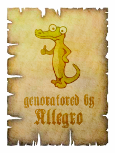
"Allegator" just makes it look like we don't know how to spell.
... Beary's Bash? 
Nice! IMO, I think Mark Oates' examples demonstrate that the alligator, not the 'A', is the real logo...
What exactly does genoratored mean?
Nice! IMO, I think Mark Oates' examples demonstrate that the alligator, not the 'A', is the real logo...
It's more like the alligator is the mascot. But yeah, if you have other text like Mark's samples, the A is possibly just redundant. On the wiki, it works great with the A.
genoratored
genorated
You mean "genoratored"?
It's more like the alligator is the mascot. But yeah, if you have other text like Mark's samples, the A is possibly just be redundant.
If any artists here are looking for a project I think it would be cool to animate the new Alex the Alligator some.
AH! he's quick!
Haha, fixed before your edits!
http://allegro.cc/files/attachment/592581
Experimenting with a yellow belly... Ignore it, really.
Dennis, now that we know you have talent, will you be available to make art for our games?
Dennis, now that we know you have talent, will you be available to make art for our games?
!
he needs the sword, too
http://www.allegro.cc/files/attachment/592582
he needs the sword, too
http://www.allegro.cc/files/attachment/592582
Ooh, can I have your permission to use that in an RPG?
... no, I'm not joking.
yeah, you bet!
It makes me want to make an RPG staring Alex...
thanks!
Dennis, now that we know you have talent, will you be available to make art for our games?
Will you be ready to send awesome amounts of money(in cash, unmarked) my way? Seriously, I'm already working on some game art in my freetime(for Andrei Ellman's Chickens) and I won't take up any more workload on my shoulders until that is finished.
And now for something completely different (couldn't resist):
http://www.allegro.cc/files/attachment/592583
Nice try, but I know it's fake! Only the upper teeth of alligators can be seen when their jaws are closed (unless they are deformed...). (Unless it's just white tribal markings, then maybe it is real!)
http://www.allegro.cc/files/attachment/592584
More, more, more!
Ooh, can I have your permission to use that in an RPG?
Can someone produce anything on Johan Peitz giving away Alex?
[append]
Here is where he doesn't give away Alex. You should talk to him before using him in a game.
It makes me want to make an RPG staring Alex...
In my excitement I forgot to say, that would be so cool!
Cheers!
I like Mark's suggestion of using it in variations too. I can see the glowing alex being used for Neon Wars.
I've updated the wiki to the latest logo, and made it so it grabs the logo from here, so any wiki sysop can reupload without having to go through me Just click on the "Upload a new version of this file" link, re-upload, and let it overwrite the old.
I like Mark's suggestion of using it in variations too. I can see the glowing alex being used for Neon Wars.
I like the variations, too.
I wonder... Could someone gifted in the ways of the pixels make one that looks... well, presidential?
I wonder... Could someone gifted in the ways of the pixels make one that looks... well, presidential?
I present to you: Alex Lincoln. (or, Ol' Tricky Dick -- Dick Nixon, as Meatwad says)
http://www.allegro.cc/files/attachment/592588
Note: not to be taken seriously.
It makes me want to make an RPG staring Alex...
I have a (bad) idea for a new demo, a platformer featuring Alex!
Mark Oates: LOLgators?
Meh, it sucks, but anyway
{"name":"592589","src":"\/\/djungxnpq2nug.cloudfront.net\/image\/cache\/8\/e\/8e27181ee6159e3bef0d8839fed2ca9b.png","w":375,"h":281,"tn":"\/\/djungxnpq2nug.cloudfront.net\/image\/cache\/8\/e\/8e27181ee6159e3bef0d8839fed2ca9b"}
http://www.allegro.cc/files/attachment/592591
http://www.allegro.cc/files/attachment/592593
http://www.allegro.cc/files/attachment/592590
http://www.allegro.cc/files/attachment/592594
Crocodile logos, eh?
http://www.museesdegrasse.com/partenaires/Data/logo/logo_lacoste.gif
When deciding on a logo, we must bear in mind the types of games that Allegro is best suited to making. IMO, Allegro is best suited to making sprite-based games - that is, games using pixel-art instead of vector-art. Johan Peitz's games are a good example of this. Not only that, but he also designed Alex (or is that Alix) the Alligator. This means that whatever logo we chose, it should have a pixelly/rasterised look. I like the one Onewing posted. It would make a good icon. Perhaps we could use the vectorised 'A' with a pixellated Alex like the one on http://alleg.sourceforge.net/logos.html
alex.png
If we do go the way of the vectorised image, I would encourage it to be rendered to a smaller bitmap which is zoomed to give it a pixelly effect. I still think there should be an official 32x32 icon, and even a 16x16 icon (which could be used as the Allegro webpage's favicon). Both these icons should be limted to 16 colours to not only encourage the low-colour look, but to make it easier for people working with limited palettes to include the logo. In fact, we could even embed these two icons inside the DLL so anyone can grab and display whatever the official Allegro icon happens to be. It would be good if the Allegro tools and test-programs used this icon (although it might make the Allegro examples unnescescarily complex if they use the icon as well).
What I'd also like to see is an official 1-bit bitmap. That is, just one colour. It can be used to darken an area, shift the hue, or use do other interesting effects with colourspace-channels.
As well as the "A", the word "Allegro" could also be created using the same font just in case somebody needs it.
Although Alex (Alix?) has been on the Allegro web-page for some time, he has sort of seeped into the subconciousnesses of the Allegro community. Not onyl that, but his retro/pixelly look is consistent with what I had in mind. Therefore, I think he should be declared the official mascot.
But I agree with the opinion that we don't need to shove it down people's throats as the official (whatever that means with Allegro...) logo.
I think it's good to have some official logo, so that anyone who wants to use a logo in a splash-screen or a credits-screen can have a bitmap to use if they want to use one. If everyone uses the same bitmap, it will give an identity to Allegro games (the 'Allegro' logo/mascot will be consistent accross several gmaes). The only way to harmonise the 'Allegro' bitmap usage is to declare one official. What I'm not arguing for is to make using it compulsory, as not everyone wants to mention what libraries they used.
The official logo could be used in the documentation, the Allego Demo-game, the test.exe program, and the icon can be used for various EXEs that come with Allegro. Also, it's nice to have an official mascot.
That's from the ST cracking crew Automation isn't it?
It definitely came from the ST Demoscene, but I'm not sure where it originated. For all I know, it could have originated on an Amiga demo and have been ripped by an ST demo-group. Nethertheless, I seem to remember that font appeared in more ST demos than any other font. But nethertheless, I'm surte that just about any graphics/fonts etc that originated on the ST/Amiga demoscene in the 80's must be in the public-domain by now.
The logo has a chrome 80's ish look which gives it an oldskool appeal. I have zoomed it 2x to make it look more pixelly because Allegro is suitable for sprite/bitmap based graphics.
Andrei Ellman's is good, but as he says, the font's not his.
As I said above, I'm pretty sure the font is public domain. I'm sure Demo-crews of the 80's really don't care.
It's usable, but it has a very old school genre look. It is screaming "Lo-res, 256-color, shootem-up from the 90s."
Isn't that what most Allegro games are like?
but think it would be cool if Allegroites switched to Allegators
How about Allegrogators.
Dennis, now that we know you have talent, will you be available to make art for our games?
Hey, I saw him first
Mark Oates: LOLgators?
LOLligators!
Anyway, here is a list of my preferences for the logo (my favourite first).
#1: The pixelated A with Alex (or is that Alix) the Alligator that Onewing posted. No matter what the size, the resolution of the logo in 'pixels' should be no more than 32x32
#2: The vectorised version with Mark Oates's 'more saturated' colours (or colours similar to the ones in the pixelated logo). Oh, and if we're giving the Alligator a white outline, I vote that we give the 'A' an additional white outline on top of the black outline.
{"name":"592549","src":"\/\/djungxnpq2nug.cloudfront.net\/image\/cache\/9\/a\/9a88430e92869c823c4feb3aeaf12e94.png","w":374,"h":371,"tn":"\/\/djungxnpq2nug.cloudfront.net\/image\/cache\/9\/a\/9a88430e92869c823c4feb3aeaf12e94"}
#3: My proposal (or a variation thereof)
{"name":"592476","src":"\/\/djungxnpq2nug.cloudfront.net\/image\/cache\/e\/3\/e3c2f65c2cd9b1f4195a6bc55db99a90.png","w":480,"h":84,"tn":"\/\/djungxnpq2nug.cloudfront.net\/image\/cache\/e\/3\/e3c2f65c2cd9b1f4195a6bc55db99a90"}![]()
#4: Sevalecan Dragon's 2nd one (with red 3D text).
{"name":"592498","src":"\/\/djungxnpq2nug.cloudfront.net\/image\/cache\/2\/0\/20c532b8009ee11a192f84d8fbc8b61b.png","w":610,"h":167,"tn":"\/\/djungxnpq2nug.cloudfront.net\/image\/cache\/2\/0\/20c532b8009ee11a192f84d8fbc8b61b"}
#5: relpatseht's
http://allegro.cc/files/attachment/592417
#6: Derezo's 1st one (the PONG themed one)
{"name":"d0dec831d040f4c090a5b3a1abe1aa4b.jpg","src":"\/\/djungxnpq2nug.cloudfront.net\/image\/cache\/9\/e\/9ebecbe544d2a30572fb4749246de5f0.jpg","w":452,"h":196,"tn":"\/\/djungxnpq2nug.cloudfront.net\/image\/cache\/9\/e\/9ebecbe544d2a30572fb4749246de5f0"}
#7: Peter Wang's one with the curly brackets
{"name":"592472","src":"\/\/djungxnpq2nug.cloudfront.net\/image\/cache\/2\/8\/28aeff1eb9c2fee035ecbd64000b8b8a.png","w":416,"h":93,"tn":"\/\/djungxnpq2nug.cloudfront.net\/image\/cache\/2\/8\/28aeff1eb9c2fee035ecbd64000b8b8a"}
I think that the 'Allegro' ASCII-art logo currently used in the docs should be the official ASCII-art allegro logo.
     ______   ___    ___
    /\  _  \ /_ \  /_ \
    \ \ \L\ \//\ \ //\ \      __     __   _ __   ___
     \ \  __ \ \ \ \  \ \ \   /'__`\ /'_ `/\`'__/ __`\
      \ \ /\ \ _\ _ _\ _/\  __//\ \L\ \ \ //\ \L\ \
       \ _\ _/____/____\ ____\ ____ \ _\\ ____/
	/_//_//____//____//____//___L\ /_/ /___/
				       /____/
				       _/__/
As for the Allegro motto, I propose "Hey Allegro, you are the one.".
AE.
Allegro is best suited to making sprite-based games
All the allegro games I'm making now use vector-generated graphics. If somebody wants a pixely version, the feel free to make an adaptation to the fore mentioned logo.
Here:
http://www.allegro.cc/files/attachment/592600
http://www.allegro.cc/files/attachment/592601
7 colors. I even included clown vomit pink for the background.
(In reference to Andrei's post.) If it were 1992, I'd agree with you. But it's not, so I don't. Of the logos in your post, I think all of them (besides #2) are pretty much all-out horrible.
But this why I'm not in favor of an "official" logo; once you slap "official" on it, people get all upset that their favorite wasn't chosen. Just let people use whatever logo they want without feeling compelled to use some specific one. (Sure, the demo game can include a logo, but it wouldn't be any more "official" than the Allegro 4.0 FLIC.)
Allegro doesn't need some standard logo to achieve brand recognition. It will always remain a library used primarily by a handful of hobbyist game makers, regardless of if we use a fancy logo, a low color bitmap, or none at all.
(In reference to Andrei's post.) If it were 1992, I'd agree with you. But it's not, so I don't. Of the logos in your post, I think all of them (besides #2) are pretty much all-out horrible.
I agree. Allegro needs some nice, slick, professional, or nearly professional look for anything that might be considered even remotely official.
I couldn't care less if there is an official logo or not, but some real slick icons are needed for things like websites and default exe icons. And ones that don't look like they are older than Doom 1.
I'm going to add a page to the wiki where people can attach their favourite logos.
I agree. Allegro needs some nice, slick, professional, or nearly professional look for anything that might be considered even remotely official.
Thirded. Low quality graphics suck. Unless I misunderstand something, Allegro is capable of handling professional art.
Thirded. Low quality graphics suck.
Not fourthed. A premise is good enough for a logo for me. Alex is the mascot, put him next to the A and you've got the logo. Alex should look like the above Alligator done by CGames and Dennis (and whoever else). That way, Andrei can use the pixelatted version, people making 3D engines can use a 3D version, etc. Considering Allegro spans all kind of projects, from good to bad, the logo should be flexible to be acceptable. That's why I agreed to the "variations" that Mark suggested. The one currently on the wiki I'm going to call "approximately official" (because it sounds nerdy and I'd be proud to wear that symbol/logo on a jock-like letterjacket).
Ohh, Can I get a mix of these two?
{"name":"897a511ecb4dbc4d3b859a50b9c3e8da.png","src":"\/\/djungxnpq2nug.cloudfront.net\/image\/cache\/8\/a\/8a00c2f5c59245caa3cbf8499e8857ef.png","w":255,"h":256,"tn":"\/\/djungxnpq2nug.cloudfront.net\/image\/cache\/8\/a\/8a00c2f5c59245caa3cbf8499e8857ef"}
{"name":"9a88430e92869c823c4feb3aeaf12e94.png","src":"\/\/djungxnpq2nug.cloudfront.net\/image\/cache\/9\/a\/9a88430e92869c823c4feb3aeaf12e94.png","w":374,"h":371,"tn":"\/\/djungxnpq2nug.cloudfront.net\/image\/cache\/9\/a\/9a88430e92869c823c4feb3aeaf12e94"}
Basically, I like the nose in the former, but it needs the little black outline on the right side of Alex thats in the second. Also, I'd like a transparent bg
First of all compliments on the allegro logo (Yeah, I mean the one on the wiki and I know it's not official ). Looks good. Rescalable two thumbs up.
But as the nitpicker that I am, I do have some criticism. As already mentioned it looks like the mascot standing in front of the logo... implicitly making the logo that big ol' "A" which I think is a bit bland for a logo. It would be nice to see "Allegro" spelled out in that font.
Having said that, I have to contribute something. Okay, I utterly suck at drawing on the computer, but here goes...
http://www.allegro.cc/files/attachment/592604
http://www.allegro.cc/files/attachment/592605
I just thought a music note in (kiddy) colours spells out fun and fits graphics of all caliber. Ofcourse that's a little bland too...
The motto could be less sarcastic: "play it allegro".
On a side note, when I ripped that first image I noticed that the line under Alex' chin is kind of weird. I don't think there should be a black line there. (Alex the allegrator? )
I ripped that first image I noticed that the line under Alex' chin is kind of weird.
That and the line for his knee stood out. But I've seen plenty of professional logos and animated characters that have weird little quirks like that, it adds character.
I have a (bad) idea for a new demo, a platformer featuring Alex!
Make sure you ask Peitz' permission first. Don't forget he already made 4 games with Alex.
[LATER...]
I've updated Tegel to show the allegro Logo in the about box (in this case the pixelated logo done by Mark Oates)
http://www.allegro.cc/files/attachment/592606
I'm slowly going to update all my games to use the allegro logo somewhere.
I have a (bad) idea for a new demo, a platformer featuring Alex!
How about you make him dance at the end of each level?
That and the line for his knee stood out. But I've seen plenty of professional logos and animated characters that have weird little quirks like that, it adds character.
I was under the impression those "quirks" were shading... It might look better if there was some gradient in the shading as opposed to solid black, but I don't think it needs it...
Basically, I like the nose in the former, but it needs the little black outline on the right side of Alex thats in the second. Also, I'd like a transparent bg
Not sure what you mean with that. Are you referring to the jaggy "cheek" and the uneven width of the black outline? (Could you post an image with an arrow pointing on what you are reffering to?)
As for transparent bg: All the attachments in this post (which includes the latest version of the shapes with Ryans colors in png format) have a transparent bg.
7 colors. I even included clown vomit pink for the background.
It appears that you based that pixel version on the old shapes ('wrong' nose, old belly form). Other than that I like it, though even a pixelled version could at least have some manual antialiasing on the outlines.
I still like the logo in LexMenu.
I have a (bad) idea for a new demo, a platformer featuring Alex!
I'm working in the Allegro.pas demo game yet, so don't steal my ideas (ask Johan if you don't believe me ).
By the way, are you going somewhere? I want to use the official logo in Allegro.pas and next release is planned next month .
Well if a logo is ever finally decided on and picked would it be possible to have a function in the new api that does a cutscene or intro with something along the lines of "Made with Allegro game programming library" with the new logo fading in and out.
Something like:
al_advert();
Of course the image should probaby be dumped and stored in a header or something and as well as account for the current set screen size.
It's just an idea though, it would be great to be able to have something like that imo.
Hi all,
Andrei Ellman pointed me to this thread and it appears to be full of Alex stuff so I thought I should say something.
First, I'm flattered! If the Allegro community picks up Alex as mascot/logo/whatever it would be very cool. (And by the way, his name is Alex The Allegator.) Somethings however to think about:
I own and intend to keep owning the intellectual property that is Alex the Allegator. Same gos for all other rights (c, tm, etc). However, I would gladly license Alex to the community for free, but we can sort out the details for that later (if it becomes the option of choice).
Keep up the good work! (I'll be monitoring this thread.)
However, I would gladly license Alex to the community for free, but we can sort out the details for that later (if it becomes the option of choice).
Would you also license him to the community for free if he did not become the official logo/mascot?
As it is now, we have a lot of inofficial logos among which is also the vectorized Alex The Allegator and I guess if anybody wants to use that as the logo in their games, they need to have a license for that as well.
Don't know if what I say makes sense, I'll try to say it shorter: The community wants/needs(to be on the safe side) a license to use Alex The Allegator as the logo for Allegro, independent of whether it becomes an official logo or not.
And I see one more problem with rights: Matthew said that he grabbed that big blue A from somewhere. There could be copyright issues attached to that as well, unless of course the source was in the public domain. (Would not be funny to get a call someday from someone saying "Hey, I'll sue you for using my A without permission!")
Now what is the next step?
Should there be an official logo challenge? (runtime: one or two months, winner cast by democratic vote of the community(two picks per member allowed), the logo picked by the vote will become official and henceforth will be included with all future versions of Allegro)
As it is now, we have a lot of inofficial logos [awiki.tomasu.org]
Can you link to wiki.allegro.cc instead from now on? Thanks
Hm... can you try to reverse the order of Alex and the A?
So he stands on the left of the A instead of the right. I think it would like he is standing there, leaning against the A. Also, since part the tail would be covered by the horizontal bar of the A, it would get more depth.
Peitz, could you clarify a bit more?
Your opinion will potentially affect the decision on what the logo should be, so I think we should clarify the details before we make a decision:
Would you...
1 allow use of the name "Alex the Allegator" for
a) included with the source of the allegro library itself
b) included in the official allegro demo game
c) the official allegro website
d) the allegro wiki
e) on allegro.cc
f) in any game or program that makes use of allegro, to indicate that it was made with allegro
g) in any game or program that makes use of allegro, for any other reason
2 allow use of the original pixelated logo for the allegro library
a) included with the source of the allegro library itself
b) included in the official allegro demo game
c) the official allegro website
d) the allegro wiki
e) on allegro.cc
f) in any game or program that makes use of allegro, to indicate that it was made with allegro (e.g in a splash screen, as the application icon or in accompanying documentation)
g) in any game or program that makes use of allegro, for any other reason
3 allow use of the new vectorized logo for the allegro library
a) included with the source of the allegro library itself
b) included in the official allegro demo game
c) the official allegro website
d) the allegro wiki
e) on allegro.cc
f) in any game or program that makes use of allegro, to indicate that it was made with allegro (e.g in a splash screen, as the application icon or in accompanying documentation)
g) in any game or program that makes use of allegro, for any other reason
I'm not saying a "NO" on any of these is bad, but more clarification would be in order. Also, if we do choose Alex as a mascot / logo, it will be necessary to include these terms in the allegro license, lest somebody steals your character a few years down the road.
But nethertheless, I'm surte that just about any graphics/fonts etc that originated on the ST/Amiga demoscene in the 80's must be in the public-domain by now.
Definitely not, because it's less than 50 years so even if the artist croaked while putting in the last pixel, it is still under copyright protection. The same goes for the A in the Alex logo. Which font is that? If it belongs to the Monotype company there could easily be a bill for €300 + punitive damages, looking for a mat to land on.
I'd dearly like to use Futura in DevAlleg, but that's €350 per font, or €1350 for the whole typeface.
EDIT: no need for anyone to tell me I'm being paranoid. I'm just playing Devil's Advocate in case we want to cross our t's and dot our i's legally.
no need for anyone to tell me I'm being paranoid.
It's not paranoid to avoid using IP whose ownership/usage is unknown... It's smart. Besides, IMO, the 'A' doesn't do anything for the logo...
In the pixeled version, sure. The A in the vector version has changed too dramatically to be considered the same one. The shape may be the same, but as one was pixeled and one was vectored, I don't think there's any comparison, plus the shading was changed.
Maybe somebody can re-pixelate it based on the vector version?
There is also the option to change the shape of the A a bit. Maybe even redesign the whole logo from scratch. Alex The Allegator could probably stick his upper body through the center of the A, his one arm lying on it like on an open car window while he'd still do that "thumbs up" gesture with his other arm. This would also give the logo more depth.
I don't think either of the suggestions for repositioning Alex sound good. I am only visualizing it, though, and it's just my opinion
I hereby change my #1 choice to the vectorised A that everyone else is supporting.
A good argument for making it the 'official' logo is that it's development was a team effort, it's approval has the consensus of a.cc'ers and I don't think that anyone objects to the design (although I think there's still a few outstanding niggles about the minor details).
Also, I like the pixellated logo Mark Oates drew. Bear in mind that rasterisation of vectorised images does not work well at low resolutions, so the rasterisation would have to be done by hand. Would still be nice if there were 'official' 32x32 and 16x16 pixel-versions of the final design for the vectorised image.
It would be nice to include this logo in some form in the forthcoming 4.2.2 release (even as a large bitmap in the demo.dat file).
AE.
Your opinion will potentially affect the decision on what the logo should be, so I think we should clarify the details before we make a decision:
Lots of questions.
I think if Johan has any reservations at all, then we shouldn't even call the mascot Alex or use any of his original bitmap versions. Plus Dennis could take a bit more creative liberty with the alligator's look so as not to blatantly copy the original sprite.
The reason is simply that there's no way we can police the usage of it. The fact is, it's impossible for Johan to keep trademark and let people use it in their games. And we don't want to get in the business of having to send people cease and desist orders. It's against the whole nature of Allegro.
That is I really don't think Allegro benefits from including a mascot / logo in its distribution that has a stricter license than Allegro.
There is also the option to change the shape of the A a bit. Maybe even redesign the whole logo from scratch. Alex The Allegator could probably stick his upper body through the center of the A, his one arm lying on it like on an open car window while he'd still do that "thumbs up" gesture with his other arm. This would also give the logo more depth.
That could work. I think it would be nice to merge the A and Alex together better... The current version makes them look like two separate images, one pasted over the other one...
That is I really don't think Allegro benefits from including a mascot / logo in its distribution that has a stricter license than Allegro.
Maybe we should go with a puma...
As it is now, we have a lot of inofficial logos
My Star-of-David Allegro logo isn't up there...:(
I think if Johan has any reservations at all, then we shouldn't even call the mascot Alex or use any of his original bitmap versions.
I agree... but I'm wondering if Johan considers the vectorized version too close to the pixelated version?
Suppose we include this as the offical logo, and we don't want to add a special paragraph in the allegro license, then we can't prevent people from making games using some alex-like character.
I think if Johan has any reservations at all, then we shouldn't even call the mascot Alex or use any of his original bitmap versions. Plus Dennis could take a bit more creative liberty with the alligator's look so as not to blatantly copy the original sprite +...
...+ It's against the whole nature of Allegro.
I couldn't agree more.
.
Hmm.. Alan the Ardvark?
Richard the Phipps!
משה המושט
A fish for a logo, now that wouldn't be bland at all!
I assumed Johan had given us the pixelated version under the Allegro license (i.e. anyone can modify and redistribute it) a long time ago, else we never should have put it into the distribution. The file is called "alex.png" and "alex.xpm" in SVN - so if we are not allowed to use that name, we need to change it (e.g. to "logo.png" and "logo.xpm"). And the new mascot should definitely have all the points raised by Dennis allowed, i.e. it should be compatible with Allegro's license.
I must say, things are not moving fast enough here. (No decisions are being made and that can't go on forever. We need a dictator/fearless leader for "art" that comes with the lib.)
We've been discussing on IRC this morning, that it might be wise to brainstorm and create an entirely new character, whose sole purpose of existance it would be to be the mascot for Allegro. That way, we could give that new character away freely within the Allegro giftware license.
So far, there have been suggestions to make a new Allegator and just not call him Alex (but that would be quite lame and cheap).
Another suggestion was an Alley-Cat or some sort of bird(an Albatross perhaps).
(puns were made: Allegro - Free Like A Bird, Allegro - Free As In Bird(not beer))
Well, most of that discussion was probably just joking around but I for one do think that the idea of having a unique new character(created/chosen by the community) as the mascot is good.
There was also the idea to have that character depicted in various different activities which could be used as header-images to various sections of the manual.(Matt had already created a few sketches with an Allegator for that purpose:one,two,three,four)
Another idea that has been brought up was that the mascot could lead through a few short introductional tutorials about using the library, which I think is a very good idea.
Well... brainstorm away! Suggest an animal+name which should become the Allegro mascot! Also give some reason why you think that the animal you suggest would be a good mascot for Allegro and give some characteristic properties that the mascot should have. (examples from the Wikipedia mascot page: "Wikipede is male, bookish, and an individualist." "The Miwiki ant is innocent, wide-eyed, androgynous, and collectivist.")
[edit]256th post(in this thread) \o/[/edit]
{"name":"Allosaurus_BW.jpg","src":"\/\/djungxnpq2nug.cloudfront.net\/image\/cache\/0\/d\/0daf3428a1846fdb78fc1cbbff9d4f66.jpg","w":800,"h":469,"tn":"\/\/djungxnpq2nug.cloudfront.net\/image\/cache\/0\/d\/0daf3428a1846fdb78fc1cbbff9d4f66"}
Allegrosaurus!
Actually it's an Allosaurus...
Considering the difficulty in deciding on a new logo, it's no wonder that development of Allegro 5.0 has taken so many years..
Committees just do not work.
I like the allegosaurus. It's old but cool. Seems fitting
Haha, I just remembered this flash. I don't think that it's the same species though...
My logo contribution:
http://www.allegro.cc/files/attachment/592634
Allan the Allegrosaurus!
(I know it's not a perfect logo... but what do you think of the character?)
This thread reminds me The Ents' Council
Looks familiar.
No offense, but I think "Allegrosaurus" is lame...
So I was playing around with this site out of boredom. Here's two more additions:
http://www.allegro.cc/files/attachment/592635
http://www.allegro.cc/files/attachment/592636
I must say, things are not moving fast enough here.
This thread reminds me The Ents' Council
"Well, well," says Treebeard, "things will go as they will; and there is no need to hurry to meet them."
I just now realized how that which I said earlier clashes with my sig. So well, take your time, no need to rush anything.
Nah, I think you're right Dennis, a decision needs made. In fact, we need a Decider. A Fearless leader as it were.
...
I just wrote a long winded rant about needing a fearless leader. But whatever. I do think someone needs to take up the position, but who is willing?
At least we need to make a decision about whether the terms for using Alex the Allegator logo are acceptable or not.
And looking at this thread, I think the consensus is that we can't do that without changing the allegro license, which is not desirable.
So can we at least make the decision not to use Alex the Allegator? Then we could drop that and move on to the next question: finding a suitable alternative.
---
It is unfortunate, but I don't think we can get around the fact that it is a lengthy process to choose a logo. Allegro has no Benevolent Dictator, so the only way we can make decisions is by consensus.
It seems to me a lot of the logo's here can't be used because they use a non-free font. Can we at least sort out the ones with problems like that?
And looking at this thread, I think the consensus is that we can't do that without changing the allegro license, which is not desirable.
So can we at least make the decision not to use Alex the Allegator? Then we could drop that and move on to the next question: finding a suitable alternative.
I nominate Chris Barry!
Allegro has no Benevolent Dictator, so the only way we can make decisions is by consensus.
It does, actually, but the post is sortof vacant at the moment. I subtly tried to get Elias or Peter to take this on, but I was either too subtle or neither of them felt like it.
It does, actually, but the post is sortof vacant at the moment. I subtly tried to get Elias or Peter to take this on, but I was either too subtle or neither of them felt like it.
Thats the same thing as not having the post at all
If we could get someone elected that actually has time or can make time for the position, I'd be plenty happy.
Well, in absence of there being a "new" dictator, I sort of feel the position is still mine, which makes me feel bad because I don't have enough time for it at the moment. Peter is managing the releases at the moment, which is probably one of the more annoying aspects. Then again, it's not necessarily the Dictator's responsibility to do this.
If anyone want to volunteer, they should post on the mailing list so we can have some discussion (if necessary). We might also discuss what sort of things the Dictator is responsible for. IRC would be ok for doing that if a meeting is ever held at a time when I can actually attend.
it's no wonder that development of Allegro 5.0 has taken so many years..
But Allegro 5.0 was released five years ago. Unfortunately someone messed up with Allegro 5.0's time-space functions and we all are inside this stupid eternal loop.
Hi, this is just a little reminder that we have taken this whole thing to the next level: http://www.allegro.cc/forums/thread/592305
Still nothing "official", but if the process outlined in that thread comes up with a quality mascot, the chances seem to be high that it will get included within the lib.
So, if you haven't already done so, show your support by adding your mascot suggestions to that thread(read OP in there for details on how to make your suggestion).
If you previously suggested a mascot in here, please suggest it again in that thread and don't forget to add characteristics and reason why it should be the mascot.
If we're going for a dinosaur as a mascot, I suggest 'Allegrosaurus'.
AE.
I like Alex.
Our quest to find the holy allegro mascot has finally come to an end!