http://sourceforge.net/projects/orwelldevcpp/?source=recommended
Has anyone else tried this newer version of Dev-C++? I was totally surprised to find this project on sorceforge.
Features:
* Includes MinGW GCC 4.6.2 32bit or...
* Includes TDM-GCC 4.6.1 64bit
* Provides syntax highlighting for code, header and resource files
* Supports code completion and autocomplete
* Shows information about code when hovering above code
* Supports GPROF profiling
* Provides user-editable shortcuts and tools
* Supports multiple languages
* Supports GNU GDB debugging
* Supports code folding
* Supports devpak IDE extensions
I may try it out.
Well the Orwell Dev-C++ isn't the same as the Bloodshed Dev-C++. Just like wxDev-C++, Orwell is just a guy/team that picked up the code and started updating it on his own. I've not messed with it as I just use command line and Geany/Vim/Sublime Text 2.
It's portable! I love it! thanks 
I realize this. They took the old Dev-C++ and are updating it, making their own version, whatever... you're picking nits. Looks good to me from the screen shots. I like the version of GCC they're using for 64bit as well.
* Supports code completion and autocomplete
How good is this, does it auto complete Allegro's functions? Code::Blocks doesn't, for example.
Eclipse does :p
How good is this, does it auto complete Allegro's functions? Code::Blocks doesn't, for example.
I haven't installed it yet, should be interesting to see if that works.
I use wxDevC++, but I'll have to try this out. I program a lot with wxWidgets, so this kind of makes sense. Dev-C++ is still my C++ IDE of choice despite all the haters. Now if only we could convince them to merge wxDevC++ with Orwell...
I realize this. They took the old Dev-C++ and are updating it, making their own version, whatever... you're picking nits. Looks good to me from the screen shots. I like the version of GCC they're using for 64bit as well.
No, you want to see nit picking, go to Cplusplus.com and make the generalization of Bloodshet/Orwell/wxDev-C++ and they will rip you a new one (as they did me).
No, you want to see nit picking, go to Cplusplus.com and make the generalization of Bloodshet/Orwell/wxDev-C++ and they will rip you a new one (as they did me).
It's as much Dev-C++ as Allegro is still Allegro even though someone else is maintaining it.
I could care less what a bunch of anal retentive nerds think. 
With that said, I doubt I will use this version, even though it IS up to date, and I like the fact that you get a couple different C99 settings and you can make it default to C (not C++)... I don't like the fact that Dev-C++ doesn't have an easy way to switch between debug and release modes. I have grown fond of being able to have many different builds (on my Deluxe Pacman I have a debug, release (normal 32bit) and a special AMD64 build).
I'm quite surprised they haven't added in what I feel is needed functionality in a modern compiler.
I'll stick to Code::Blocks, it's grown on me now.
Edit: Actually, I've been using the CodeBlocks nightly builds and it's been pretty good. (http://forums.codeblocks.org/index.php/board,20.0.html)
Sounds like it's worth giving it a try. I like particularly the part about it beign portable.
Nostalgia bombed. I feel young again.
Edit: Woah I am realizing how awful our color schemes and contrast were back in the day. We probably all nearly went blind/insane using Dev-C++.
Compare it to something modern like this:
{"name":"NBbQK.png","src":"\/\/djungxnpq2nug.cloudfront.net\/image\/cache\/3\/0\/302ee427fc5548dcf5a801efe294a130.png","w":1920,"h":1080,"tn":"\/\/djungxnpq2nug.cloudfront.net\/image\/cache\/3\/0\/302ee427fc5548dcf5a801efe294a130"}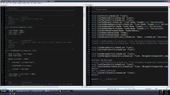
I've been using the Dev-C++ color scheme since I started coding, since it was what I was used to. Is a dark color scheme like that one easier to work with in your opinion?
Is a dark color scheme like that one easier to work with in your opinion?
I liked the dark background in DOS better than dark chars on a light background, but having a 45hz interlaced refresh might have had something to do with that. Now I like black chars on parchment white.
I use editors and then command line to compile. I personally like vim (and my terminal is set to black with green text (matrix colors) but once in a while I use Geany, but I use the invert color option so that it is black background color. I've read that the white background color can make it hurt your eyes after a while of staring at it when coding.
90% of my time I'm programming at 2 A.M just like I'm doing right now. I feel that a white background burns my eyes.
I can do either or. I usually have a black background.. right now it's blue though, with a huge font.
{"name":"606326","src":"\/\/djungxnpq2nug.cloudfront.net\/image\/cache\/a\/b\/ab5e7ddc6199d5b4c146b7d987b51029.png","w":1280,"h":800,"tn":"\/\/djungxnpq2nug.cloudfront.net\/image\/cache\/a\/b\/ab5e7ddc6199d5b4c146b7d987b51029"}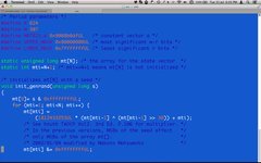
I feel that a white background burns my eyes.
<stasbmode>
You turned the brightness all the way up, didn't you? You took it out of the box when you bought it, started fiddling with the knobs without reading the instructions, left the brightness all the way up, and now it's gonna burn out in less than a year. You know what? We ought to send them out from the factory broken, and save everybody a whole lot of trouble!</stasbmode>
This is what my two IDEs look like when I use them:
{"name":"606328","src":"\/\/djungxnpq2nug.cloudfront.net\/image\/cache\/b\/0\/b036144b7ef159296fa030e6feb9c453.png","w":1366,"h":768,"tn":"\/\/djungxnpq2nug.cloudfront.net\/image\/cache\/b\/0\/b036144b7ef159296fa030e6feb9c453"}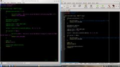
Here is mine, basically:
{"name":"606341","src":"\/\/djungxnpq2nug.cloudfront.net\/image\/cache\/6\/1\/610af3a0769c5a1951277b0e3cae67f7.png","w":1196,"h":582,"tn":"\/\/djungxnpq2nug.cloudfront.net\/image\/cache\/6\/1\/610af3a0769c5a1951277b0e3cae67f7"}
I don't have my code here with me at work, so I just used an example file.
I find white background a little bit and less relaxing, but with a dark background I also can't use maximum white or maximum green or font color for example, because it makes the text too bright and glowey.
Also sometimes I use a really dark blue instead of dark black. With LCDs instead of CRTs it doesn't really matter if you don't use absolute black.
Mine's a bit more artistic 
{"name":"606343","src":"\/\/djungxnpq2nug.cloudfront.net\/image\/cache\/4\/7\/478356affe8f703c6187a0acfc939219.png","w":1280,"h":800,"tn":"\/\/djungxnpq2nug.cloudfront.net\/image\/cache\/4\/7\/478356affe8f703c6187a0acfc939219"}
I've been playing around with the colour scheme recently and have come up with this one. It seems easy on the eyes. A Matrix/DOS style scheme. Keywords and variables are all shades of green, text, numbers, characters are all shades of blue or cyan, processors, operators and bracers are all shades of yellow/orange. Comments are all shades of grey (no, not 50  ).
).
{"name":"606344","src":"\/\/djungxnpq2nug.cloudfront.net\/image\/cache\/d\/f\/df53697ff27feaa656414c646b8b2af3.png","w":955,"h":627,"tn":"\/\/djungxnpq2nug.cloudfront.net\/image\/cache\/d\/f\/df53697ff27feaa656414c646b8b2af3"}
If the font size seems large it's because my eyesight has been fluctuating lately (diabetes). Although it seems larger in this pic than it does on my screen.
Edit: I don't use white in anything but my cursor, and as you can see, it really stands out this way, which is nice because I seem to easily lose track of it.
Edit: I also use a dark blue background for highlighting selected text, bright cyan for highlighting matching brackets.
Kronk: I like your scheme.
You people are weird.
{"name":"606346","src":"\/\/djungxnpq2nug.cloudfront.net\/image\/cache\/2\/8\/2807cce6db1ea3a9bdff0e637f7e9e02.png","w":1060,"h":869,"tn":"\/\/djungxnpq2nug.cloudfront.net\/image\/cache\/2\/8\/2807cce6db1ea3a9bdff0e637f7e9e02"}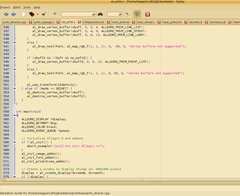
I use a tweaked version of this one:
{"name":"vs2010_expression_thumb.jpg","src":"\/\/djungxnpq2nug.cloudfront.net\/image\/cache\/e\/d\/edcfb1aef3ef6986048a819eb59f400e.jpg","w":700,"h":485,"tn":"\/\/djungxnpq2nug.cloudfront.net\/image\/cache\/e\/d\/edcfb1aef3ef6986048a819eb59f400e"}
I find inverted colors very hard on the eyes. Everything is black-on-white for me.
{"name":"a90d5e4346355448329a618ec91320d4fe32b40cb07581226924c0fb25bf0a9da5017a2394a8407245d66f998d1f5265c8709122502b0a16.php","src":"\/\/djungxnpq2nug.cloudfront.net\/image\/cache\/f\/9\/f98e5bd71f316b8592f4ecbef7f354ac.png","w":1436,"h":868,"tn":"\/\/djungxnpq2nug.cloudfront.net\/image\/cache\/f\/9\/f98e5bd71f316b8592f4ecbef7f354ac"}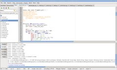
SiegeLord, very nice!
I used to use a light on dark theme. But these days I just stick with Kate's default.
More or less looks like:
{"name":"kate_part.png","src":"\/\/djungxnpq2nug.cloudfront.net\/image\/cache\/c\/e\/cead6a4f2dc7cc831e7a3ded628d3738.png","w":532,"h":470,"tn":"\/\/djungxnpq2nug.cloudfront.net\/image\/cache\/c\/e\/cead6a4f2dc7cc831e7a3ded628d3738"}
and:
{"name":"606347","src":"\/\/djungxnpq2nug.cloudfront.net\/image\/cache\/d\/5\/d5d852b3c41d8d20e3251ca03ab64e66.png","w":1280,"h":760,"tn":"\/\/djungxnpq2nug.cloudfront.net\/image\/cache\/d\/5\/d5d852b3c41d8d20e3251ca03ab64e66"}
p.s. I wrote the Document Viewer pane you see on the left.
My eye doctor even said, when I saw her a few years back (been a while), but she even said the white is hard on the eyes and to dim the screen if you can't change the colour scheme. She is the reason I went to dark colours because he her telling me the brighter the screen or the items on it the harder it is on the eyes. Figured that is the main reason they use the screens you put over the monitor to dim the brightness of the screen.
Elias, though, looking at your scheme makes me wish I had your theme for the window scheme and geany theme. Your themes are nice in my mind so that is worth risking my eyes . What themes are they? I don't think I have that one (assuming you are in KDE).
Elias, though, looking at your scheme makes me wish I had your theme for the window scheme and geany theme.
The GTK3 theme used by Geany here is called "Adwaita" (which is the default). And the XFCE window manager theme is called "Default".
[edit:] And looking at Tomasu's screenshot, Qt/KDE looks basically identical
Somebody at work I know uses a proportional font in his code editor and he didn't understand when I said he was a freak 
As for colours, it's white background all the way for me. When I was young I had to use Wordperfect (Office on DOS was just hideous with all that ASCII graphics) but the background had to be blue otherwise I just couldn't do any work. Strange how times change.
{"name":"urejevalniki_wordperfect_2.jpg","src":"\/\/djungxnpq2nug.cloudfront.net\/image\/cache\/5\/8\/5878e7e17b8505625b23bb0cae9f22c0.jpg","w":600,"h":352,"tn":"\/\/djungxnpq2nug.cloudfront.net\/image\/cache\/5\/8\/5878e7e17b8505625b23bb0cae9f22c0"}