While I'm still hanging around, would anyone happen to want a new website for any reason? I won't charge you anything to build it, but I'm not covering hosting fees and whatnot (except in some really exceptional circumstance). 
I'm looking for a smallish, fun project to work on while classes are in session. If you want a new personal site or have an idea for a website and don't have the time/ability to build it yourself, something along those lines, let me know. 
add: Oh, for the concerned (beggars, choosers, etc.), my most recent work was on my rebuilt portfolio (which is in limbo until I get more of an erm...portfolio).
I need a facebook clone. I need it in a week. Thanks in advance!
I need a facebook clone. I need it in a week.
Will a screenshot of the homepage printed out and taped to your monitor do? 
Sorry that was my stupid joke to go along with the "how long would it take to build facebook" thread  . I actually need an SMF theme done but that's not exactly a website and I already made an offer to someone and am waiting for response.
I'm unfamiliar with Simple Machines' theme setup, but I'm not opposed to projects that aren't strictly websites. 
Like uh...here's a poster/card I made one afternoon a year or two ago:
{"name":"604823","src":"\/\/djungxnpq2nug.cloudfront.net\/image\/cache\/e\/3\/e3c6cf57e9590a25bbdaf9f788bcb486.jpg","w":406,"h":720,"tn":"\/\/djungxnpq2nug.cloudfront.net\/image\/cache\/e\/3\/e3c6cf57e9590a25bbdaf9f788bcb486"}
I would like a mobile theme for the wiki. Something that'll work on a smartphone.
Otherwise the only site that's actually in service right now is my computer repair site (http://tomscomputers.ca). I could use a new design for that too, my skills aren't that hot.
I feel a little unqualified for doing mobile designs, being one of the last seven people without a smartphone to test them on.  But I can whip up something for the repair site, if you like.
websites are easy, design and art are hard.
websites are easy, design and art are hard.
Ah, but a website without without design or art is actually called 'HTML'. And some would argue that a real craftsman has his brushstrokes in the markup, even.
I'm no (graphical) artist, but I'd like to think that my design sense has improved by leaps and bounds in the last few years.
I'd love a website for my latest game which is nearing completion. I don't have time to create a website myself.
I'd love a website for my latest game which is nearing completion.
Hey James, I remember you helping me out a lot when I was coming around here daily for programming help! I'd love to repay the favor, what kind of timescale are you looking at? Thomas' project is small enough that I could probably squeeze both in.
But I can whip up something for the repair site, if you like.
That'd be cool. I've been thinking about splitting it up into a few different pages rather than having it all on one page like that. But that'd mean I'd have to write more flavour text, which I am clearly not good at.
Ah, but a website without without design or art is actually called 'HTML'.
What about variables, you gotta have variables. 
For quick no-nonsense sites I've been really impressed with concrete5 (http://www.concrete5.org/). It's one of those light-weight cms's that has no massive bloated admin like joomla, etc, everything is just edited inline. The only thing missing really is a forum plugin.
That'd be cool. I've been thinking about splitting it up into a few different pages rather than having it all on one page like that. But that'd mean I'd have to write more flavour text, which I am clearly not good at.
I actually quite like the idea of the whole thing being on one page, it acts more like a pamphlet than a book. The only issue is condensing the space down. Someone looking for your price on Windows system tweaks has to do a lot of skimming to get there.
I was also going to ask, are you terribly committed to the wording? Things like moving the pricing out to its own space jumps to mind (being that pretty much everything is the same price, with a few outliers at a second price).
I actually quite like the idea of the whole thing being on one page, it acts more like a pamphlet than a book.
Then it'd look like one of those HOW TO MAKE MILLIONS OF DOLLARS IN JUST A WEEK: THE HIDDEN SECRETS OF MAKING MILLIONS OF DOLLARS IN JUST A WEEK sort of websites...
@Anomie: I like how you rank your HTML/CSS skills well above JavaScript (in fact JavaScript isn't even listed as what you primarily do), yet your Web site doesn't display sensibly without JavaScript. 
Append: I agree that Thomas Fjellstrom's site is just fine all on one page. There are ways to better organize the information on the page, but there's no good reason to split it up just because.
yet your Web site doesn't display sensibly without JavaScript.
Well I didn't write that Javascript. If anyone's interested in why it breaks:
There's this awesome thing called Less.js, which 'precompiles' your CSS for you, giving you features like 'mixins' (which behave basically like CSS functions), variables, selector nesting, arithmetic, some handy functions for manipulating colors, and access to the Javascript environment - all directly from the CSS file. The only downside (as bam has discovered) is that everything barfs without Javascript enabled.
The Less.js guys do offer a Mac-based compiler tool, so that you can compile all of your *.less syntax into a plain CSS file (minus the Javascript stuff you'd be grabbing from the browser) for production. Being that I'm not on a Mac, I went ahead and made a modified version of the JS file that prints out the compiled CSS, instead of applying it. The plan is to use Less.js during development, then convert it over to plain CSS when it's ready to publish. Being that my site's still in limbo, I haven't bothered converting it over yet.
I was also going to ask, are you terribly committed to the wording?
Hells no. That's the flavour text I was talking about.
Things like moving the pricing out to its own space jumps to mind (being that pretty much everything is the same price, with a few outliers at a second price).
See I kinda tried that with the first layout, people had to ask... It's hard to find a layout that actually works. But at least the price in each section makes it clear what that feature costs. But a full "table" of prices somewhere else would make sense too.
There are ways to better organize the information on the page, but there's no good reason to split it up just because.
It's not "just because", I can make more specific ad's and link them directly to their own page.
I can make more specific ad's and link them directly to their own page.
This would be the best solution. The landing page should only serve as a shallow frontend for all offered services (along with some generic, but relevant, information).
The landing page should only serve as a shallow frontend for all offered services (along with some generic, but relevant, information).
Fair enough, I'd say what's there now is fine on one page, but adding sub-pages with additional information would be fine.
Fair enough, I'd say what's there now is fine on one page, but adding sub-pages with additional information would be fine.
Though it could use some work. I've hacked that page together in a few hours on a few separate days
Here's the new markup, for all you kids following along at home. Just fudged the pricing for now. I noticed you were using the HTML5 doctype, but none of its features! 
Looks a little bare: http://tomscomputers.ca/index-new.html
Looks a little bare
But deliciously descriptive!  But on that note, a good way to gauge your markup is to look at it with no styling and see if it still makes sense (also good for accessibility purposes, people with screen readers won't see anything but markup). Looking at the new markup vs the old markup (minus CSS), there's already a noticeable improvement.
Design comes next, do you want me to wing it or would you like to go through the standard 'client questionnaire' process ('describe the organization in five words', 'rate the organization on the following, between one and ten', etc)?
Hey James, I remember you helping me out a lot when I was coming around here daily for programming help! I'd love to repay the favor, what kind of timescale are you looking at? Thomas' project is small enough that I could probably squeeze both in.
I've been thinking about it a bit more and I guess the game probably isn't really in a complete enough state to warrant a website. I've not yet even committed to a name for it, and I'm probably going to re-skin the main background which would need to be consistent with the website design.
However, if you're still willing then that would be awesome. I think that at this stage it would make sense for it to simply be a single page with a few screenshots, download link etc. I can provide you with a screenshots plus the high-res photoshop originals of the game graphics if you'd like to feature these. I'd ideally like the style of the page to be similar to the game (i.e. stainless steel on black).
Design comes next, do you want me to wing it or would you like to go through the standard 'client questionnaire' process ('describe the organization in five words', 'rate the organization on the following, between one and ten', etc)?
Basically I want something clean, simple, and professional.
I need a web site/ online system.
for Atlantic Tailoring you can find them on face book.
its a tailoring shop.
I've been thinking about it a bit more and I guess the game probably isn't really in a complete enough state to warrant a website. I've not yet even committed to a name for it
That probably means I'd have just enough time to build the thing. Call it 'Lands of Lohr'.
But yeah, sounds good. If you're going to be passing around game assets, do you want to do this through email?
Basically I want something clean, simple, and professional.
I'm on it! I'll stick with the blue/(white/grey) + serifed font.
for Atlantic Tailoring you can find them on face book. its a tailoring shop.
That doesn't sound fun. I am for hire though!
If you want to learn something and do something productive you can help me working on a build server. I have hacked together a quick site here:
It's performing nightly builds showing the console output of the build process live on the site. I can maintain this myself, but if someones takes care of that I can concentrate more on core development.
Your website is really interesting. The "Clients Only" part was cool. I assume you know none of the links work.
For Tom's site, one could argue that SEO rank is improved by having multiple, focused pages, instead of everything on one page (If he cares). I personally would also find it "easy" to navigate if there were dedicated pages on pricing or services.
I can maintain this myself, but if someones takes care of that I can concentrate more on core development.
Sounds interesting, could I get some more details of what you're looking for?
Your website is really interesting. The "Clients Only" part was cool.
I was wondering if anyone would find that. Ph34r my digital collage skillz.
For Tom's site, one could argue that SEO rank is improved by having multiple, focused pages, instead of everything on one page (If he cares).
That's true, but I'd think in the case of a local business the value of SEO on individual services is basically moot compared to SEO for location. That said, I don't bill myself as an SEO expert. 
add:
So here's draft one Mr. Thomas, don't pay too much attention to things below the Big Blue Bar(c). I started playing with wording for some things, realized I was a little tired fairly quickly. Let me know if I should carry on and polish it up, or if I'm off course.
{"name":"604826","src":"\/\/djungxnpq2nug.cloudfront.net\/image\/cache\/6\/0\/605d38e6710d4e18ce8397e1a4a764e3.png","w":1920,"h":1080,"tn":"\/\/djungxnpq2nug.cloudfront.net\/image\/cache\/6\/0\/605d38e6710d4e18ce8397e1a4a764e3"}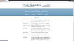
That looks really good, Anomie.
So here's draft one Mr. Thomas, don't pay too much attention to things below the Big Blue Bar(c). I started playing with wording for some things, realized I was a little tired fairly quickly. Let me know if I should carry on and polish it up, or if I'm off course.
I like that. A lot.
Is your layout easily re-formable to a mobile (phone) screen? How hard would it be to add a separate css file just for phones (and maybe tablets?). I've had some complaints that my site doesn't work well on phones
That looks really good, Anomie.
I like that. A lot.
{"name":"282fae47-4d5d-4838-90aa-4a96b96f7e75.jpg","src":"\/\/djungxnpq2nug.cloudfront.net\/image\/cache\/0\/9\/09fa3b081191f634ab7afa4821919d37.jpg","w":500,"h":375,"tn":"\/\/djungxnpq2nug.cloudfront.net\/image\/cache\/0\/9\/09fa3b081191f634ab7afa4821919d37"}
Is your layout easily re-formable to a mobile (phone) screen? How hard would it be to add a separate css file just for phones (and maybe tablets?).
It should be -- there aren't any images or anything to limit the size. I'd make 'Tom's Computers' a little smaller and cut the width of the page down to match that width, maybe remove the tagline and move the contact info into a similar position on the right side of the 'p'. I'd probably take the pitch paragraph out, and possibly remove the descriptions of each service (they could be a little wordy for phones). All that's pretty easy to do with CSS based on media queries.
But like I said above, I don't really have any mobile browsers/devices to test it on. Except my tablet, which has a higher resolution than my netbook, and doesn't really count.
Yeah, I should be able to figure it out. But I hate html and css. Almost as much as I hate javascript.
But I hate html and css. Almost as much as I hate javascript.
Aw. I guess I was lucky enough to jump on the bandwagon when HTML5, CSS3 and jQuery started being feasible options. I'm really happy with all of them. Interestingly though, your thing uses practically none of my usual CSS3 fanciness, and should look roughly the same all the way back to IE6! 
Programmers hate to learn HTML and CSS because they aren't programming languages. The former is a markup document and the latter is effectively a style data file. They were designed for documentation and layout. You have to think completely differently about them to achieve a goal.
I hated Web languages in college. The college didn't teach CSS beyond the very basics and basically just introduced HTML as a set of tags. The textbooks just had you transcribe a "working" document and open it in a Web browser. You got to see how it looked (which often varied wildly from browser to browser), but had no idea how it got there. Anybody teaching HTML should make it a rule to give CSS as much significance as HTML, if not more; you can't effectively use one without the other. They should probably just zip through XHTML syntax, basic tags, and perhaps the box model; and then introduce semantic design and CSS and spend the rest of the semester on that.
As for JavaScript, I hated it because at the time it felt like a toy language compared to the real languages I was learning, like C, C++, and Java. I'm pretty good with JavaScript, but I hold the opinion that JavaScript should be entirely optional, so I don't place much emphasis on it. Also, the browser environment suffers from far too much global state to really be enjoyable.
After working with HTML, CSS, and ~XML for about 5 years, I now understand the usefulness of them and don't mind them so much. I still suck at design (e.g., https://www.castopulence.org/), but I have a half decent handle on semantic markup and basic CSS: the Castopulence Software Web site is actually XSL<XHTML> + XML + CSS.
Programmers hate to learn HTML and CSS because they aren't programming languages.
Yeeeah, fair enough. I didn't think too much about HTML until I found aspects of it to really sink my teeth into, and built a value system for what 'good markup' is.
As for JavaScript, I hated it because at the time it felt like a toy language compared to the real languages I was learning, like C, C++, and Java.
I kind of feel that way, but it doesn't bother me. I basically use a couple dozen lines of JS for progressive enhancement stuff and call it good. I don't really feel like it being more of a 'toy' is a bad thing, possibly because my introduction to JS (via jQuery) was writing a web-based SQL*Plus clone (which introduces some neat things you'd expect from a modern terminal, as well as MySQL support, while also managing to be used by absolutely no one ).
I kind of feel that way, but it doesn't bother me. I basically use a couple dozen lines of JS for progressive enhancement stuff and call it good. I don't really feel like it being more of a 'toy' is a bad thing, possibly because my introduction to JS (via jQuery) was writing a web-based SQL*Plus clone (which introduces some neat things you'd expect from a modern terminal, as well as MySQL support, while also managing to be used by absolutely no one ).
I'm not sure what SQL*Plus is, but I'm going to assume it's a GUI client for a DBMS ... In which case, I'd say you definitely do not want a Web interface for this. There's just far too much that can go wrong. You don't want to bring database administration to the masses! Databases require a technical mind for design and management... Microsoft Access is one of the worst monsters ever unleashed upon the Earth by Microsoft.
Append:
Oh good god! That UI appears to connect to a third party database server given the user entered credentials! It's not even running over HTTPS!  YOU OWE LIKE $100k to http://codeoffsets.com/ for this. And please, for all that is FSM approved, take that site down before you cost somebody their business...
Oh good god! That UI appears to connect to a third party database server given the user entered credentials! It's not even running over HTTPS!
>:D School project, doesn't count in real life!
I hate HTML and CSS and JavaScript because its impossible to get a page rendering the same in all browsers (and versions there of) without banging your head against your desk till you die. It is completely non deterministic.
I hate HTML and CSS and JavaScript because its impossible to get a page rendering the same in all browsers (and versions there of) without banging your head against your desk till you die. It is completely non deterministic.
The trick is not to care. Build for your browser of choice, run damage control on the others until diminishing returns say stop.
>:D School project, doesn't count in real life!
I hope they failed you!
I hate HTML and CSS and JavaScript because its impossible to get a page rendering the same in all browsers (and versions there of) without banging your head against your desk till you die. It is completely non deterministic.
If you're trying to create a work of art then this matters. If you just want a Web site that looks clean and efficiently shares information with the world then it's less important for it to look pixel-perfect and more important that it just degrades nicely.
Damage control should not be necessary. Why can't they all just bloody follow the standard. Bastards.
The first version of my website was COMPLETELY broken in IE to begin with. And rendered fine in Chrome and Firefox. Sure it was a PEBKAC error, but still. I didn't know about it for a few weeks.
The way I see it, your job as a Web developer is to write the standards compliant XHTML, XSL, XML, CSS, etc. Rendering that properly and behaving properly is the browser developer's problem. They can fix it once or the rest of the world can fix it billions of times. Leave your site broken in substandard browsers and let the users discover for themselves which browsers work best. If the Web had worked this way years ago the IE developers would have been FORCED to be standards compliant. Which is the only reason they're becoming more standards compliant now. More and more developers are just saying, fuck you; and leaving a nice little disclaimer on the site for users of substandard browsers. Just to make it clear, it's not me, it's you.
Damage control should not be necessary. Why can't they all just bloody follow the standard.
Amen. In my early work, pages would work fine in Webkit stuff (I develop in Chrome), maybe half a dozen lines of CSS to fix it up for Firefox, then a two-week slog to get all the IE problems worked out. Since then I've sort of come to terms with it as a part of the process - by expecting it, it just becomes another limitation of the medium (and limitations are good!). In the early stages I take steps to avoid things that I know might be fishy, and so I have less to fix later.
add:
The way I see it, your job as a Web developer is to write the standards compliant XHTML, XSL, XML, CSS, etc.
That's all well and good, but your job as a website (yeah, you are the website) is to work for everyone. No one using a substandard browser will stop to consider that they are using a substandard browser, they will just assume you're lazy and that you only make websites for 'crazy hippies' or something (their email and bank pages work fine, after all). This is especially true when you're trying to build something for a client -- there are no excuses (except maybe for IE6).
When you're just making stuff for yourself, it's fine to take some liberties with who you want to serve and who you don't want to serve (for instance, leaving my website broken in IE<9 is a good way to filter out clients that I maybe just don't want to work for), but if it's a job for someone else it better work for the client's grandmother running AOL 2 on her Windows 95 machine.
add again:
If the Web had worked this way years ago the IE developers would have been FORCED to be standards compliant. Which is the only reason they're becoming more standards compliant now.
Speaking of that, I read through the Wikipedia article for Embrace, Extend and Extinguish about a week ago, which is a term used internally by Microsoft to describe the process of smothering competition by extending standards in such a way that the market is forced to become subsidiary or obsolete.
So the whole 'IE is incapable of Internet' game is a back-assward strategic ploy by Microsoft to keep their incompetent software relevant in the face of capable competition?
In the early stages I take steps to avoid things that I know might be fishy, and so I have less to fix later.
Working around blatant bugs and mis-features in products I'm attempting to use makes me find another product. I don't mind it if there's one or two odd bugs, especially if the vendor fixes it in a reasonable time frame. Sadly that just doesn't happen with browsers. They all think they are doing it right, and anything you think is a bug is a "feature". ie: they meant it to be broken.
I'm just kinda skimming the thread here, but I thought I'd drop this in.
In general, it's best to use HTML as markup that outlines and describes only the information - no layout at all. The information should be logically organized and easy to parse (if you were to do so). From that point on you should be using css to do the layout.
There are a number of different reasons to do this, one of which is that you can easily make different css files for different screens and output formats. You should never use HTML to position objects around on the page (e.g. <br><br><br><br>), or explicitly define the appearance (a <font> tag, for example). Likewise, you should never use tags like <b> or <i> because they describe the appearance. Instead, use the tags that define the content, <em> for emphasis or <strong> for strong. And so fourth ...
The pattern I used to develop my latest page was this (which is not live, got distracted and eventually never have time to look back at it):
Like Oates said, HTML for information purposes only. When I did this step, I sort of figured "Would it be usable in Lynx/Links". I think I used some p tags where some HTML5 tag alone would be good enough for that (I remember one of them two didn't even support div!)
I applied CSS so that mobile would work. At the time, I used a DSi and a Moto Backflip (horrible phone, I'm glad that thing broke, but not glad it broke because of some $100 fee to get a new phone mid-contract, on top of the price of the new phone)
Using media queries, I added more CSS so that it would be formatted like my current site. Whenever I get back to it, I need to make the header in the new way I'm handling it.
Site doesn't use any JS however.
I may dump what I did and start again as I don't like the file structure of it (and I plan to switch the JS from YUI3 to jQuery, still keeping the YUI CSS stuff though)
The way I see it, your job as a Web developer is to write the standards compliant XHTML, XSL, XML, CSS, etc.
To follow-up with what Anomie said... When you're writing a website, you should be writing with two audiences in mind:
Users
Search Engines
When you don't focus on that and instead focus on perfectly slicing to an XHTML/CSS compliance standard, you're writing for the wrong audience - a layout engine.
There is also a third audience that you should also be paying attention to, and that's yourself. Or, the "the developers" if there is more than one person working on the site. You should write in a way that is easiest for you (and/or them) to work with.
Before I get bammed ( ), just know that my main point that it's important to focus your energies on the priorities, instead of following an arbitrary doctrine.
p.s. In some cases there's also a fourth audience, the client. But that's a whole different can of worms.
"Would it be usable in Lynx/Links"
That's all well and good, but your job as a website (yeah, you are the website) is to work for everyone. No one using a substandard browser will stop to consider that they are using a substandard browser, they will just assume you're lazy and that you only make websites for 'crazy hippies' or something (their email and bank pages work fine, after all). This is especially true when you're trying to build something for a client -- there are no excuses (except maybe for IE6).
Standards compliant markup generally works sufficiently even in substandard browsers. You obviously will want to test this out in at least one browser (e.g., I like to use links and, only if necessary, IE). It isn't critical that a page look beautiful. What matters is that it is readable and browse-able and usable. That's all that practically matters, unless you're trying to sell snakeoil. Again and again people love to complicate matters and completely forget just how elegant simplicity can be.
When you're just making stuff for yourself, it's fine to take some liberties with who you want to serve and who you don't want to serve (for instance, leaving my website broken in IE<9 is a good way to filter out clients that I maybe just don't want to work for), but if it's a job for someone else it better work for the client's grandmother running AOL 2 on her Windows 95 machine.
Certainly, if you want to enable users to be vulnerable to Easy Hack v0.2.1(tm) script kiddie attacks. They entrust you with developing a secure piece of software for them and part of that is certainly discouraging the use of outdated software when unnecessary. Supporting buggy or vulnerable software is a bad approach. You're better off to just scare the shit out of them with talk of how vulnerable the software is to hackers and scare them into trying something different and scary, but ultimately better for them all around. Users always think that their way is best; despite it being 1000x slower, 100x more error prone, infinitely more vulnerable to malicious persons, etc. It's OK to educate them and even force them to use something different. It's not about being religious though (i.e., pushing your own ideals). It's merely about giving them practical guidelines for security and sanity. That's part of what they hired you, a computer professional, for.
Speaking of that, I read through the Wikipedia article for Embrace, Extend and Extinguish about a week ago, which is a term used internally by Microsoft to describe the process of smothering competition by extending standards in such a way that the market is forced to become subsidiary or obsolete.
So the whole 'IE is incapable of Internet' game is a back-assward strategic ploy by Microsoft to keep their incompetent software relevant in the face of capable competition?
Microsoft does this with every product that they own. If you look at their track record they really don't deserve to be as successful as they are. They don't even make an effort to write useful software. They have entire departments that specialize in figuring out how to FORCE YOU TO USE THEIR SHIT instead of moving on to something better. I imagine this is where most of their money is invested, in fact.
...you should be writing with two audiences in mind:
Users
Search Engines
When you don't focus on that and instead focus on perfectly slicing to an XHTML/CSS compliance standard, you're writing for the wrong audience - a layout engine.
There is also a third audience that you should also be paying attention to, and that's yourself. Or, the "the developers" if there is more than one person working on the site. You should write in a way that is easiest for you (and/or them) to work with.
The whole POINT of the standards is to satisfy all of those concerned the first time without having to pick and choose. The users will be happy because things will just work, and you'll get to that point a lot quicker. Maintenance is also much easier and therefore faster and therefore cheaper. Search engines are happy because the markup does a better job of describing the document structure and there's less fluff that really doesn't matter to search getting in the way. AFAIK, standards compliance is something that Google's ranking algorithms take into account (i.e., it's a good thing). As for developers, for the reasons already cited, developers should also prefer standards compliance. It means a whole lot more for less.
Before I get bammed ( ), just know that my main point that it's important to focus your energies on the priorities, instead of following an arbitrary doctrine.
Too late. Web developers have been confusing their priorities since the beginning and it really hasn't been working very well. Instead of wasting time and money developing workarounds for browser bugs and incompatibilities to satisfy the people that don't know what they want, developers should focus their energy on fixing those bugs and refusing those incompatibilities (i.e., get them standardized before touching them) and producing something that the users/clients actually want.
p.s. In some cases there's also a fourth audience, the client. But that's a whole different can of worms.
Clients don't know what they want. It's up to you to help them see. Certainly if a client comes to you looking for a work-of-art Web site to sell snakeoil then it had better look close to pixel-perfect across all popular browsers. Often, though, the users couldn't care less about the "pizazz" and only want to get whatever they came for ASAP and move on with their day. Spending all that extra money for that pixel perfect work of art is actually NOT what the client truly wants, whether they realize it or not.
Certainly if a client comes to you looking for a work-of-art Web site to sell snakeoil then it had better look close to pixel-perfect across all popular browsers.
I think you're failing to empathize with the average person. You keep reinforcing the idea that legitimately valuable information/services will prevail regardless of presentation, and that presentation (beyond efficiency) is only valuable if you're trying to bamboozle people.
The fact is, presentation promotes is the basis for the organization's professionalism and credibility to people without a knowledgeable, critical eye (more than 70% of people, I'd guess). If Company A delivers a competent service and Company B delivers an outstanding service, presentation can still easily be the deciding factor.
For instance: Microsoft. Through apparent professionalism and attractive presentation (they call these 'psychological services', things that endear the user to the organization or make them feel secure in their relationship with the organization), Microsoft trounces much more capable opposition in their market(s).
I think you're failing to empathize with the average person. You keep reinforcing the idea that legitimately valuable information/services will prevail regardless of presentation, and that presentation (beyond efficiency) is only valuable if you're trying to bamboozle people.
The fact is, presentation promotes is the basis for the organization's professionalism and credibility to people without a knowledgeable, critical eye (more than 70% of people, I'd guess). If Company A delivers a competent service and Company B delivers an outstanding service, presentation can still easily be the deciding factor.
Ultimately if the software is used for productivity then the user will prefer a functional product over an attractive one. The eye candy seems wonderful at first glance, but reliably getting the job done trumps eye candy every time. I'm not saying that your Web site should be bland and plain text and look the same in links as it does in Chrome. You can still make it look reasonably pretty without having to throw standards out the door. I think my Castopulence Software Web site is a good example of this. It has some color and layout to it without interfering too much with its use on older or less capable browsers. It doesn't look pixel perfect in all browsers and I never made any effort for it to. I did the bare minimum to get it displaying reasonably well across browsers and left it at that. It is quite usable in links, which I think is a big plus being somebody that isn't afraid to operate from a plain-text virtual terminal.
For instance: Microsoft. Through apparent professionalism and attractive presentation (they call these 'psychological services', things that endear the user to the organization or make them feel secure in their relationship with the organization), Microsoft trounces much more capable opposition in their market(s).
We've already touched on why Microsoft is "successful" and it has nothing to do with the quality of their products or the presentation therein. It's entirely to do with vendor lock-in and anti-trust tactics. Indeed, Microsoft's Web site(s) have traditionally been some of the WORST Web sites I've ever used, both in presentation quality and usablility.
Microsoft's Web site(s) have traditionally been some of the WORST Web sites I've ever used, both in presentation quality and usablility.
I was googling some MS info for this forum a few days ago, and the web page in question said something about not all the info being shown because the info wasn't pertinent to the OS detected by the browser.
You can't complain about MSDN documentation though.
I was googling some MS info for this forum a few days ago, and the web page in question said something about not all the info being shown because the info wasn't pertinent to the OS detected by the browser.
I had that happen to me a few months ago! IIRC, I was trying to figure out why ASP.NET was throwing an obscure error at my face. I was Googling with Firefox in GNU/Linux (since I had GNU/Linux and Windows running simulatenously; one of which was virtualized). Microsoft basically refused to give me the answer because I wasn't browsing from a Windows system. It's like the most blatant abuse of the Web from a hardware or software vendor that could be imagined.
Ultimately if the software is used for productivity then the user will prefer a functional product over an attractive one.
In the very specific niche of 'productivity software', you're probably right. In general however, you're looking at about 30% (I'd bet) who would convert to the less-pretty alternative in favor of functionality. You're assuming again that people approach things with a critical mind -- they do not.
Microsoft's Web site(s) have traditionally been some of the WORST Web sites I've ever used, both in presentation quality and usability.
I don't mean 'presentation' to only mean websites. It's a general principle.
We've already touched on why Microsoft is "successful" and it has nothing to do with the quality of their products or the presentation therein. It's entirely to do with vendor lock-in and anti-trust tactics.
Imagine if Microsoft never ran professional-quality ads, had no attractive marketing materials, advertised only by black-and-white copies of poorly designed posters stapled to telephone poles, and so on. No one would pay enough attention to them for their current tactics to work at all. They could never have grown to the size they did without pouring billions into presentation.
Imagine if Microsoft never ran professional-quality ads, had no attractive marketing materials, advertised only by black-and-white copies of poorly designed posters stapled to telephone poles, and so on. No one would pay enough attention to them for their current tactics to work at all. They could never have grown to the size they did without pouring billions into presentation.
I think somebody needs to go ask Wikipedia for a history lesson...
I thought it was especially juicy when an MS website promising "We have the way out" (of Unix) crashed when they switched to MS products after everyone was having a good laugh because it displayed fine when it was running on a FreeBSD server!
I think somebody needs to go ask Wikipedia for a history lesson...
Microsoft never ran...
I'll assume you're equating "never ran" and "didn't run at first". :( From what I understand, early Microsoft had limited success on its own merit (in a world with little competition). I'm talking about maybe the last ten, twenty years, when it became relevant to people in general. (nvm, this really doesn't have any bearing on what we were talking about There's a world of businesses out there that bear out the point I was making, the technicalities of this one don't matter.)
From what I understand, early Microsoft had limited success on its own merit (in a world with little competition). I'm talking about maybe the last ten, twenty years, when it became relevant to people in general.
This retelling is based on what I learned in college and read at random periods over my career as a computer programmer so don't expect this to be completely accurate. It is to the best of my knowledge how it all happened, but I may be wrong about certain parts. I don't feel like re-reading the history right now, only to reiterate it for you when you could just go read and the history yourself.
The original 2 or 3 to later become Microsoft were working with a third party hardware vendor, who had owned the rights to some OS that I think these three had either developed or modified for use on its systems. Gates suggested that they sell licenses to the OS, but the third party only cared about hardware; the software just being a necessary offer to make the hardware useful.
However it happened, Gates ended up getting the rights to this software, and started Microsoft to further develop it for competing hardware vendors. They managed to weasel an exclusive deal with IBM or something to basically bundle the OS that became MS-DOS with every PC sold. In other words, you bought DOS whenever you bought an IBM PC. This was the beginning of Microsoft's vendor lock-in.
From then Microsoft just continued to force its software on people, having it pre-installed on the vast majority of PCs purchased for the past 30 years or whatever. Most users didn't even know what an operating system was! DOS (and later Windows) was just part of the computer to them. They didn't know they even had a choice (indeed, back in the era of the first PCs, they might not have on IBM PC hardware). Law makers were (and, to a large extent, remain) just as oblivious.
These days the cycle just continues for the most part. Windows (and various Windows software) is bundled with most PCs when you buy them (usually against your will) and most consumers are completely oblivious that there are other, better options available. People have also just been used to DOS and Windows, and more importantly, used to DOS-only or Windows-only software that they feel is required for their work or play. Microsoft effectively has done everything in its power since its inception to keep PC consumers locked-in with everything that it touches.
For a completely accurate retelling, go ask Wikipedia or Google.
So in the interest of this thread not dying, here's an update. The only thing left is to figure out what's up with the hours and pricing. They don't really have enough information to justify their own categories, if you ask me. The hours have been moved to the header area, but they look cramped up there. Pricing is still lined up with the other categories, but it's awkwardly small. I'll be able to think about it more over the weekend.
I want to provide both pieces of information as little tidbits up in the header area somehow, but that'd take a completely new layout. So there might be a second draft!
{"name":"604859","src":"\/\/djungxnpq2nug.cloudfront.net\/image\/cache\/5\/7\/575aa0134889aebc99a8e4c714f9fb85.png","w":1980,"h":2027,"tn":"\/\/djungxnpq2nug.cloudfront.net\/image\/cache\/5\/7\/575aa0134889aebc99a8e4c714f9fb85"}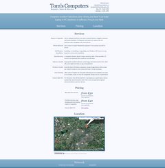
I want to provide both pieces of information as little tidbits up in the header area somehow, but that'd take a completely new layout. So there might be a second draft!
Well there are really three classes of stuff I do.
Software/OS related cleanup/install. Hardware Repair/Cleanup. And Data Recovery. Everything can be assigned to one of those three categories.
But I've found if you aren't somehow very specific while at the same time making it dead simple to find, people will still ask if you can do a certain thing, even if its on the site. It's kind of hard to do both.
If it helps, anything where I have to open up a laptop, or dirty ass PC case, I charge $40 to start.
The narrow and long vertical layout is extremely unprofessional and unattractive for consumers. If you follow Web 2.0 guidelines, you'll end up with something much more appealing and much easier for the users to navigate
The narrow and long vertical layout is extremely unprofessional and unattractive for consumers. If you follow Web 2.0 guidelines, you'll end up with something much more appealing and much easier for the users to navigate
What is that? Random boxes with ad's, animations, and "like", "+1", and "reddit" buttons strewn about?
Web 2.0 guidelines
What is that? Random boxes with ad's, animations, and "like", "+1", and "reddit" buttons strewn about?
I Googled and found this, which offered many lulz.
That said, the design looks like it follows most of this much more legitimate-looking guide (though I admit I had no intention of following any 'web 2.0 guidelines'). Of the fifteen guide topics, it looks like I've covered everything but the stupid crap ("reflections", "cute icons" and "star flashes"). The layout is a super-simple, central, single-column layout (or double-column, if you consider table columns as layout columns) that makes use of a clearly divided header section, big, bold text, strong color(s), even subtle gradients.
Well there are really three classes of stuff I do.
So are you open to trying to express that stuff in a way other than the list of 'term-exposition' pairs?
What is that? Random boxes with ad's, animations, and "like", "+1", and "reddit" buttons strewn about?
Not even close. Try again.
looks like I've covered everything
Not really. Websites crafted for the sole purpose of advertising a service should never be designed in a plain, narrow, long-vertical fashion.
Could you stop making blanket statements without explaining them.
So are you open to trying to express that stuff in a way other than the list of 'term-exposition' pairs?
So long as its easy to understand, and clear on what things I actually do, yes. I'm ok with anything.
Could you stop making blanket statements without explaining them.
Sorry, was that a question?
It shouldn't be too hard to infer that, although Anomie's design is pleasing to the eye, it won't have as good of a conversion rate as a design that followed modern product-site guidelines.
Muh, you're not making any sense so I should just ignore what you're saying.
Jesse is right, but if you view the full size version of the screenshot, it's not really that far off. I think the worst aspect of it is that the services page is just too long and boring.
Even if it's accurate, most people don't read anything. The average person just wants to know whether or not you can fix computers... I'd tend to break it down into just a few things:
Clean viruses (i.e., make a computer run faster)
Build new computers
Upgrade computers (add more "memory")
Software training / tutoring
Nobody is going to think "my computer case needs to be cleaned." Each of those four things could be a large "icon" image in a 2x2 pattern, or something like that. As little text as possible. If somebody happens to click on one of those things, then it could take them to a page explaining some of the services in more detail (not that anybody really cares).
Regarding the pricing page, simple is good. In fact, if $30 is your lowest price, then I'd not even mention the $40 price point. The goal is to get people to call / email you. That's when you can explain exactly what the cost will be.
Edit: The first website I just checked out:
Ignore everything but the home page, since obviously they do tons of things. But note how the services are very simply laid out without overwhelming amounts of text to read.
There, a nice explanation like that goes a lot further than a random statement with nothing backing it up.
Anomie,
Try putting the "names" or "types" of services above the corresponding descriptions (instead of to the left of it in a bolder face and see what it looks like.
I think the Tom's computer website looks pretty good, but I don't think it uses screen space very well. I think a table would look better - a table that included the pricing on the right hand side of the service description. And there would also be room to put the mini map on the right hand side of the table :
                 |  Services                     | Pricing   |    ---------------
-------------------------------------------------------------|    |             |
Repair/Upgrades  | Blah....                      | from $40* |    |             |
                 |                               |           |    |   MAP       |
-------------------------------------------------------------|    |             |
Threat removal   | Blah....                      | from $X   |    |             |
-------------------------------------------------------------|    ---------------

*Plus materials where applicable
Once that was done, you could remove the 'Services / Pricing / Location' header bar because it would be unnecessary.
It's been suggested that people WON'T read a page that's too wide. Especially if there's too much text.
If it was me I would condense the whole service list into a small paragraph or bullet list with links (possibly just floating tooltip type things with the extra information you have there now). I would also do what Matthew said and just give a starting price and leave it at that (with a note that parts cost extra)
It's been suggested that people WON'T read a page that's too wide. Especially if there's too much text.
With a table, you wouldn't have to worry about that, because people can just glance at the headers to see if they are interested and then if they are they can read the text that goes with it. If they are truly interested in receiving computer service, they will take the time to read what is there if it is not too long, and I think the amount of description is perfect as it is. Up to you.
Jesse is right,...
I think you're putting words into Jesse's mouth.
Even if it's accurate, most people don't read anything. The average person just wants to know whether or not you can fix computers...
*snip*
Nobody is going to think "my computer case needs to be cleaned." Each of those four things could be a large "icon" image in a 2x2 pattern, or something like that. As little text as possible. If somebody happens to click on one of those things, then it could take them to a page explaining some of the services in more detail (not that anybody really cares).
I agree with this though. The target audience is completely clueless about computers. They just want it to be fixed. They don't know and don't want to know anything about what is wrong or what they could be doing better.
But note how the services are very simply laid out without overwhelming amounts of text to read.
I don't note that at all. In fact, I find that home page rather difficult read or navigate.
I think the Tom's computer website looks pretty good, but I don't think it uses screen space very well. I think a table would look better - a table that included the pricing on the right hand side of the service description. And there would also be room to put the mini map on the right hand side of the table
Tables suck, and not everybody has a wide monitor. This is probably especially true for the target audience of the Web site. However, the font size could be increased for easier reading, and the page could be allowed to use more of the screen width (relative to the size of the monitor, rather than a fixed size), to potentially show more of the page on a single screen.
Thanks for the thoughts, there's a lot I want to say! But first:
I think it's really important to make sure that the website brings in business the way that Thomas wants. If he wants customers to come to him with a full understanding of what they're getting into, the website needs to be pretty content-heavy -- the task is presenting lots of specifics in a small space without attacking the visitor. If he wants the website to act as a 'hook' to drive people to contact him for specifics, the task is to make something that draws people in and speaks in a general and attractive way (with little copy, big shapes and so on).
Being that this started as a 'makeover' I didn't really change the layout at all, I just made cosmetic changes. If we're talking a full rebuild, I think more input from Thomas would be good before I start taking liberties with how he does business and what information he conveys to customers.
Or if he doesn't feel like dealing with all this I could just send over the HTML and CSS and call it good.
Being that this started as a 'makeover' I didn't really change the layout at all, I just made cosmetic changes. If we're talking a full rebuild, I think more input from Thomas would be good before I start taking liberties with how he does business and what information he conveys to customers.
To be honest, I'd like to do both, if possible. Simple "hook" landing page with enough info to get people to call, but also somehow provide more information. Either via fancy tool tips, collapsible "info boxes" or even separate pages.
To be honest, I'd like to do both, if possible. [...] Either via fancy tool tips, collapsible "info boxes" or even separate pages.
The first two options there are easy but can hurt accessibility and make it harder to convert into a mobile design. The third option keeps everything accessible and mobile-friendly, but coming up with new content for the pages is a lot of work. So that'd be another choice for you to make.
I'd suggest separate pages. Another option with that is to do some progressive enhancement afterward and AJAX the full page content into the landing page on request. The layout could shift to accommodate and you'd still have that simple pamphlet-like interaction with the page.
Even if it's accurate, most people don't read anything.
The target audience is completely clueless about computers. They just want it to be fixed.
I definitely took some time to reduce the copy and remove as much technical language as I could from it. For a redesign, I might suggest you go so far as to categorize your services into customer problem statements - that introduces its own challenges, but would be the easiest for a customer to digest.
I don't think it uses screen space very well. I think a table would look better
The page right now is fixed at 700px wide, which is about 250px narrower than I usually make stuff. But like bam said, you can't count on super-wide monitors, and I feel like ~950px is a good compromise between something like this and a full-width layout. I also think tables suck, but some horizontal action is important - something slightly more tabular than a plain list is good. I'm picturing widening the site out to 950px or so and doing a more magazine-like layout.
It's been suggested that people WON'T read a page that's too wide. Especially if there's too much text.
That's really important too, I think the only full-width pages I put up with on a regular basis are Gmail and the PHP.net manual pages. A.cc too, if I was around that often. But still, I think there's room to expand.
It's been suggested that people WON'T read a page that's too wide. Especially if there's too much text.
It's too easy to lose your place on the line, that's why magazines split text into two or more columns on a single page.
{"name":"fb776192078f4b4087ac7371394fc345.0.jpg","src":"\/\/djungxnpq2nug.cloudfront.net\/image\/cache\/7\/3\/73be0845533781a557095a2ca31c4a10.jpg","w":370,"h":279,"tn":"\/\/djungxnpq2nug.cloudfront.net\/image\/cache\/7\/3\/73be0845533781a557095a2ca31c4a10"}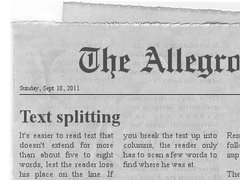
I might suggest you go so far as to categorize your services into customer problem statements
If I understand what you mean, that was my initial intent with my site, but I just couldn't figure out how to write it in a clear way, so we get what I have now. woo.
So that'd be another choice for you to make.
As I said earlier, I'd like landing pages for certain "jobs", to point specific ads at so people who click them, don't have to go find the one they are looking for.